72 Hour Emergency | Layout Design
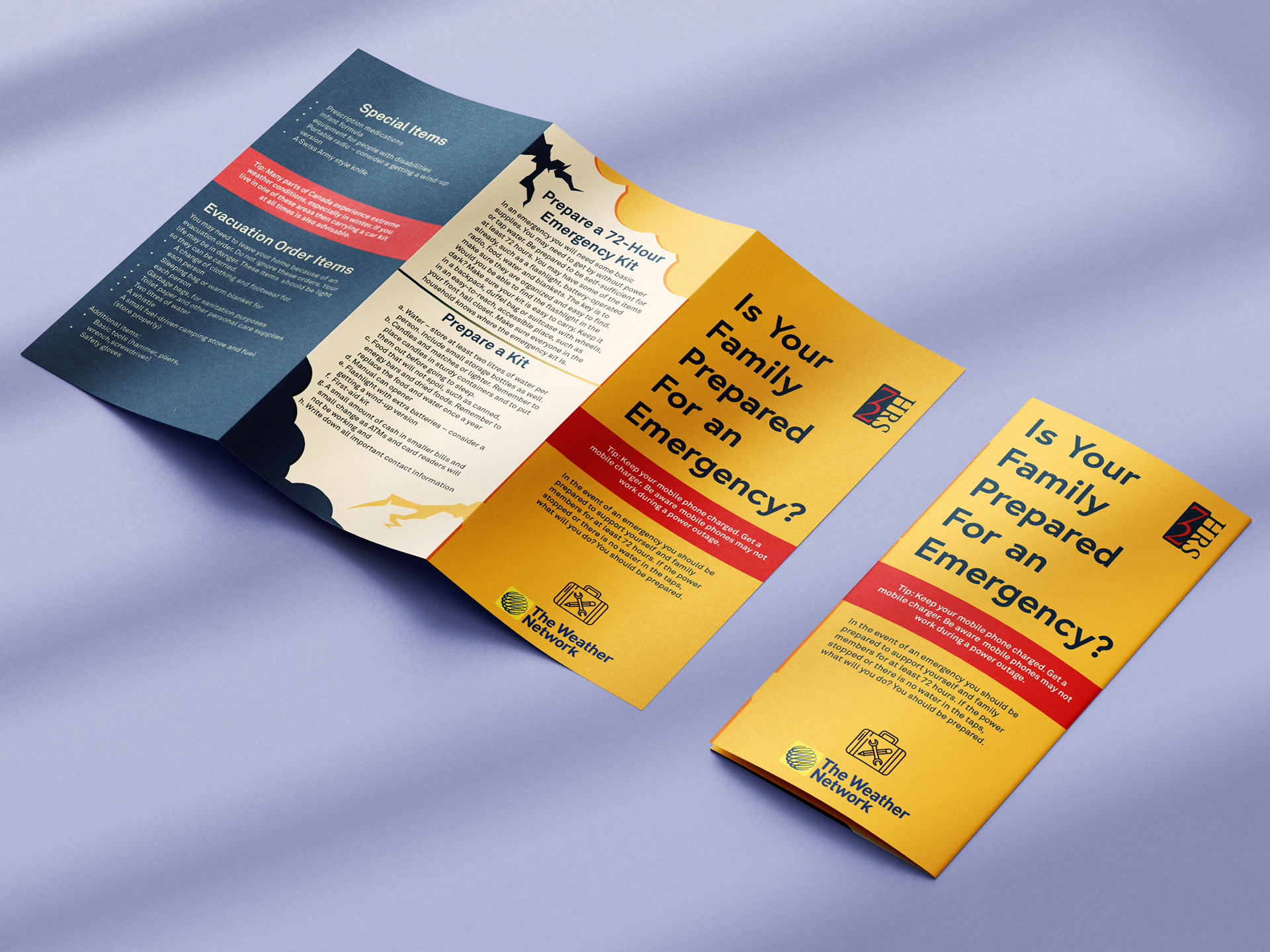
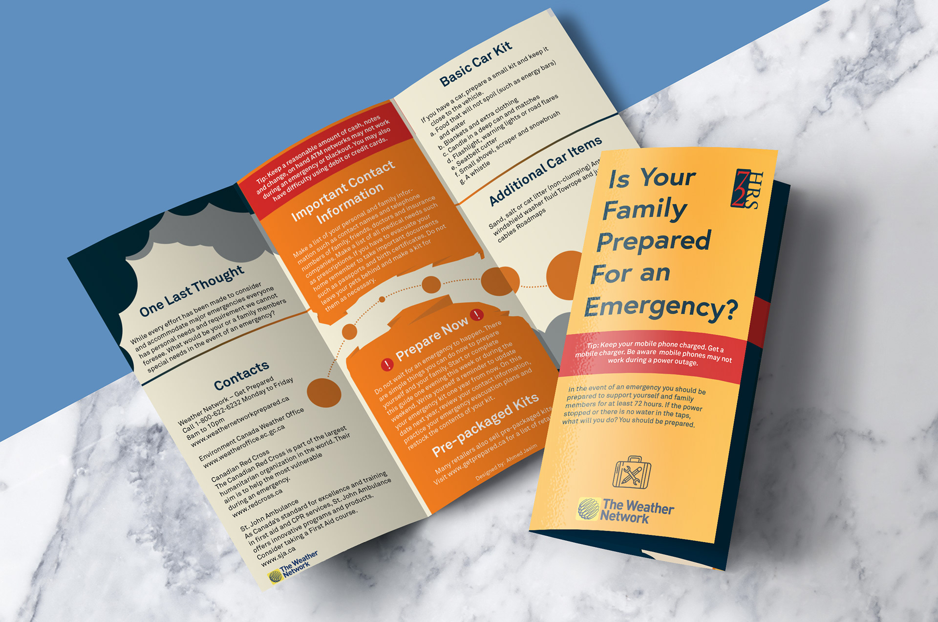
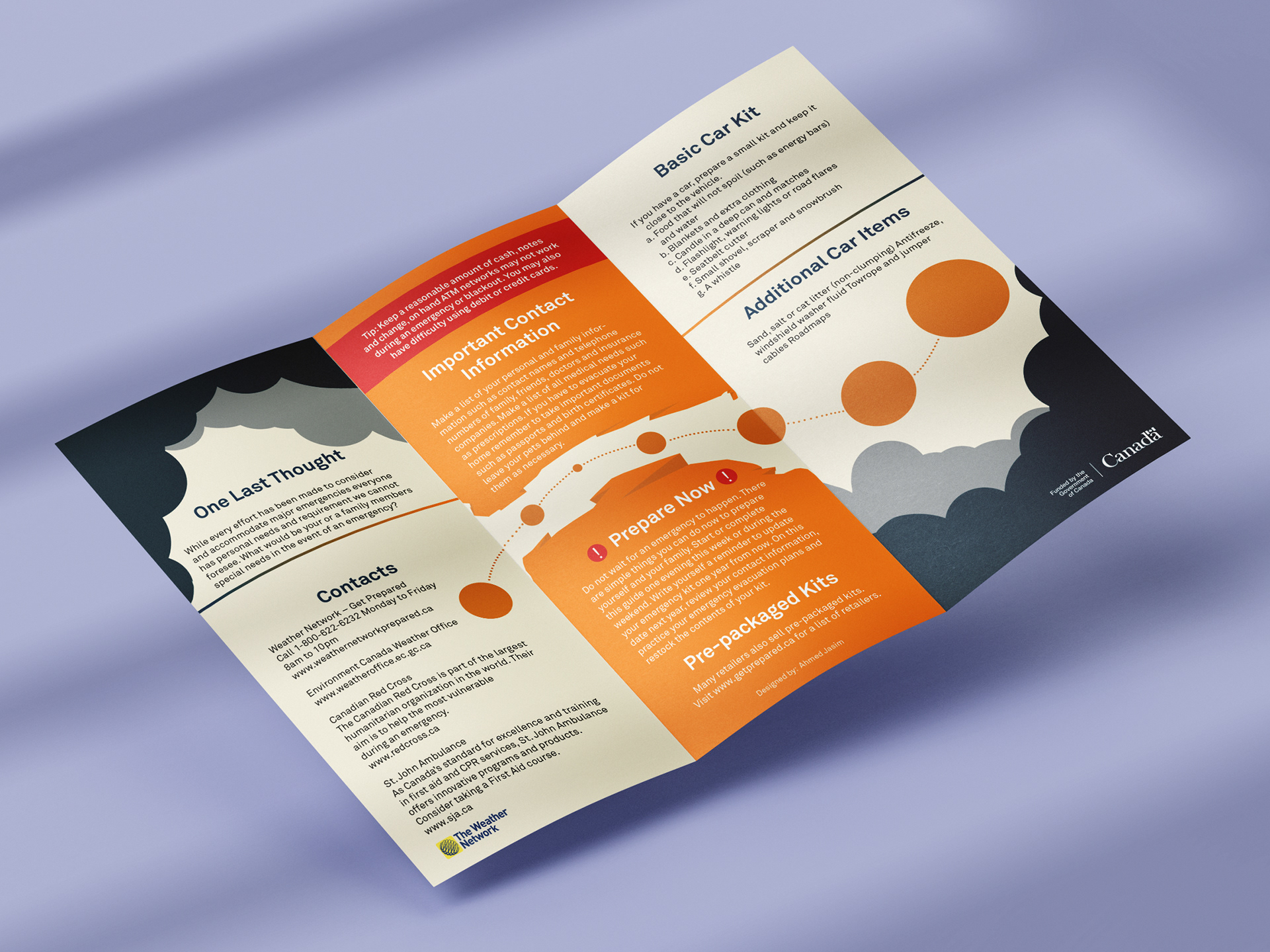
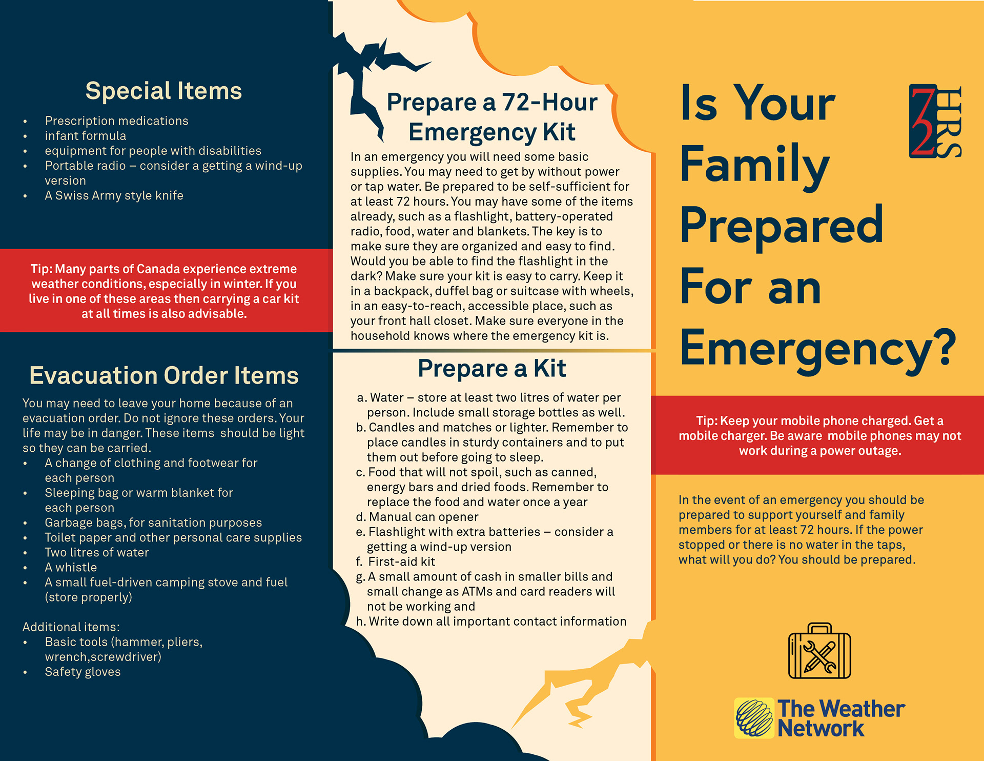
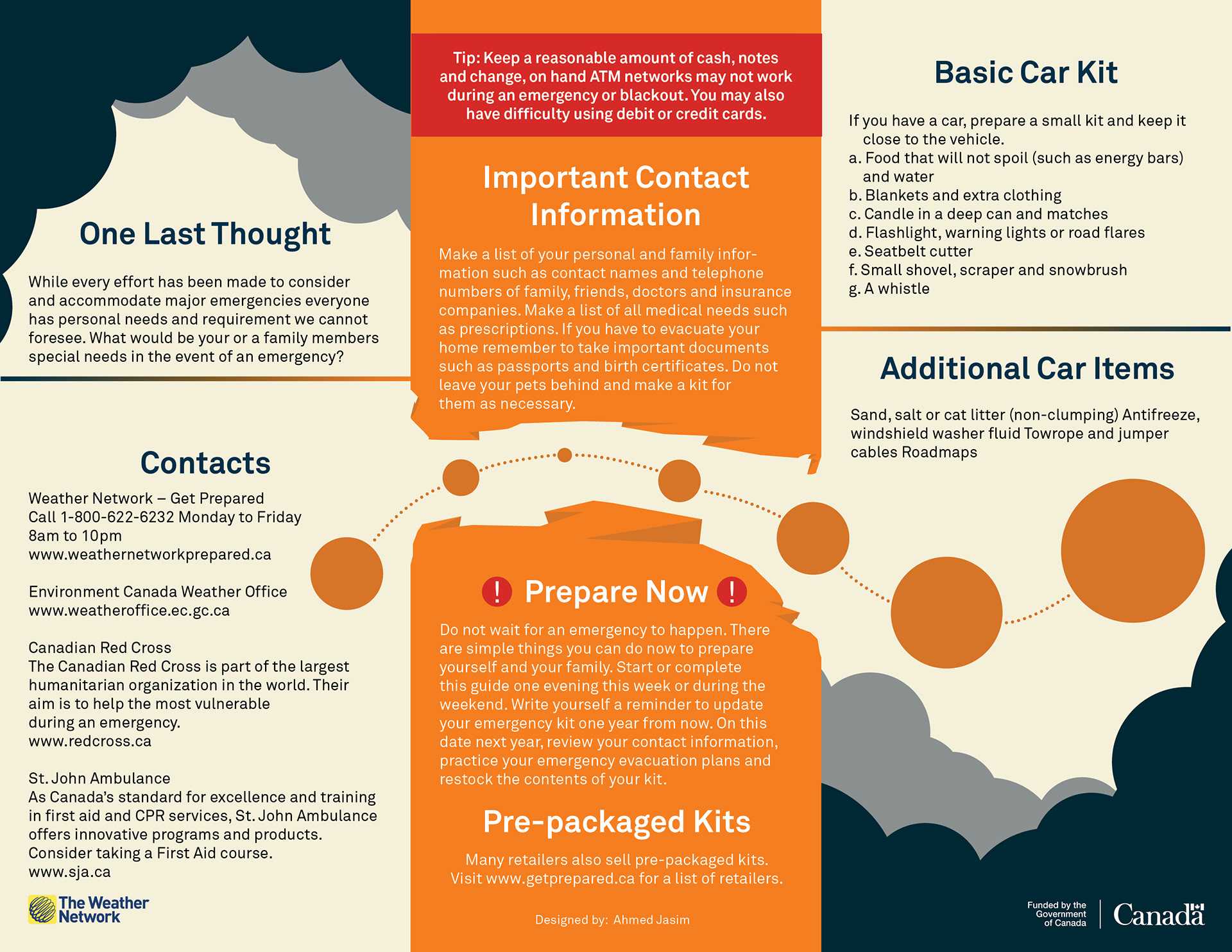
The challenge for this brochure was to capture the reader's attention to present them with important disaster relief information. this was achieved by utilizing a strong emergency-esque colour palette as well as simple yet effective design decisions that guide the reader's eyes to important to remember information.
Themes:
Bright
Warning
Flashy
Bright
Warning
Flashy
_______
Mockups
Additional mockups were designed to illustrate how the brochure would look printed.
Feel free to click each mockup for further clarity.
Mockups
Additional mockups were designed to illustrate how the brochure would look printed.
Feel free to click each mockup for further clarity.
