
Plantlets | bRAND Identity
Plantlets is a company dedicated to bringing the freshest, most nutrient-packed microgreens to your table, the client requested a logo that reflects their dedication to quality and sustainability, as well as packaging and other merchandise.
Themes:
Bold
Based
Extraordinary
Bold
Based
Extraordinary
________________
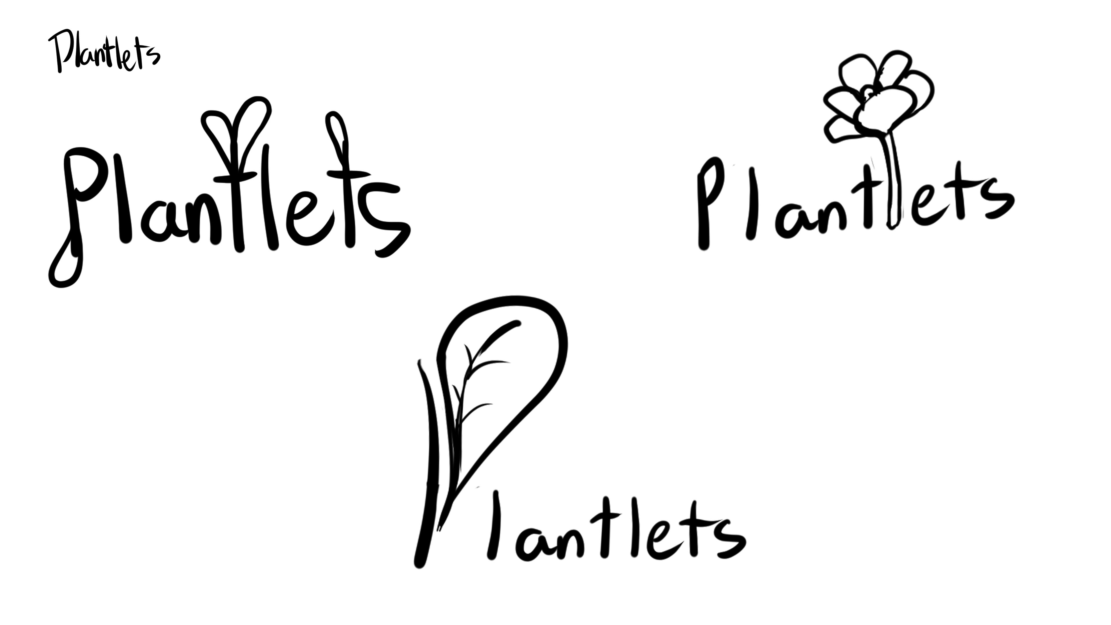
Sketches & Ideations
The ideation stage for this brief led to a more natural style, as well as a more script-like type that I felt was a strong choice. However, the sketches felt incomplete as none of the options felt like a memorable concept that a company could build a brand around.
Sketches & Ideations
The ideation stage for this brief led to a more natural style, as well as a more script-like type that I felt was a strong choice. However, the sketches felt incomplete as none of the options felt like a memorable concept that a company could build a brand around.
____________
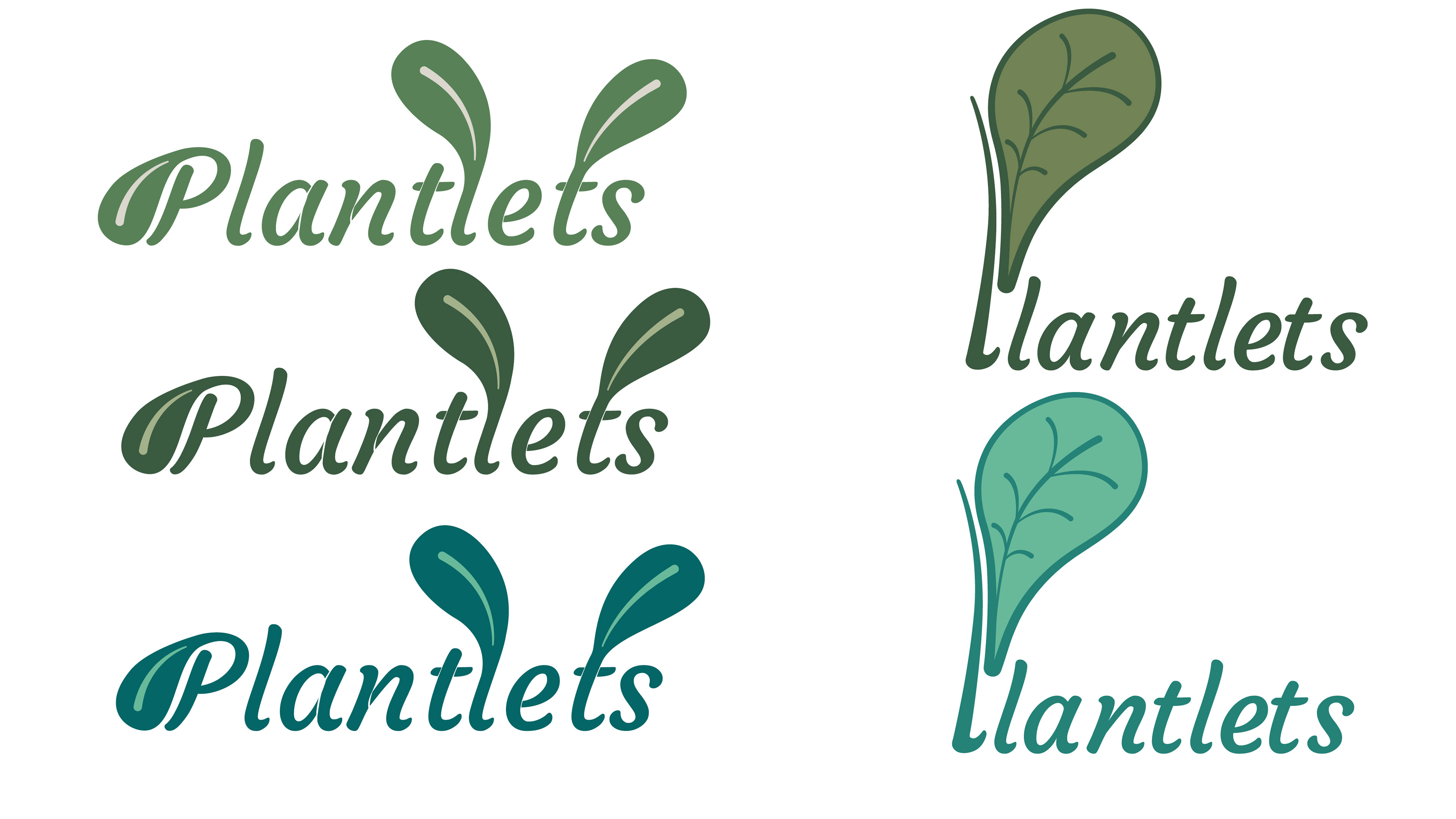
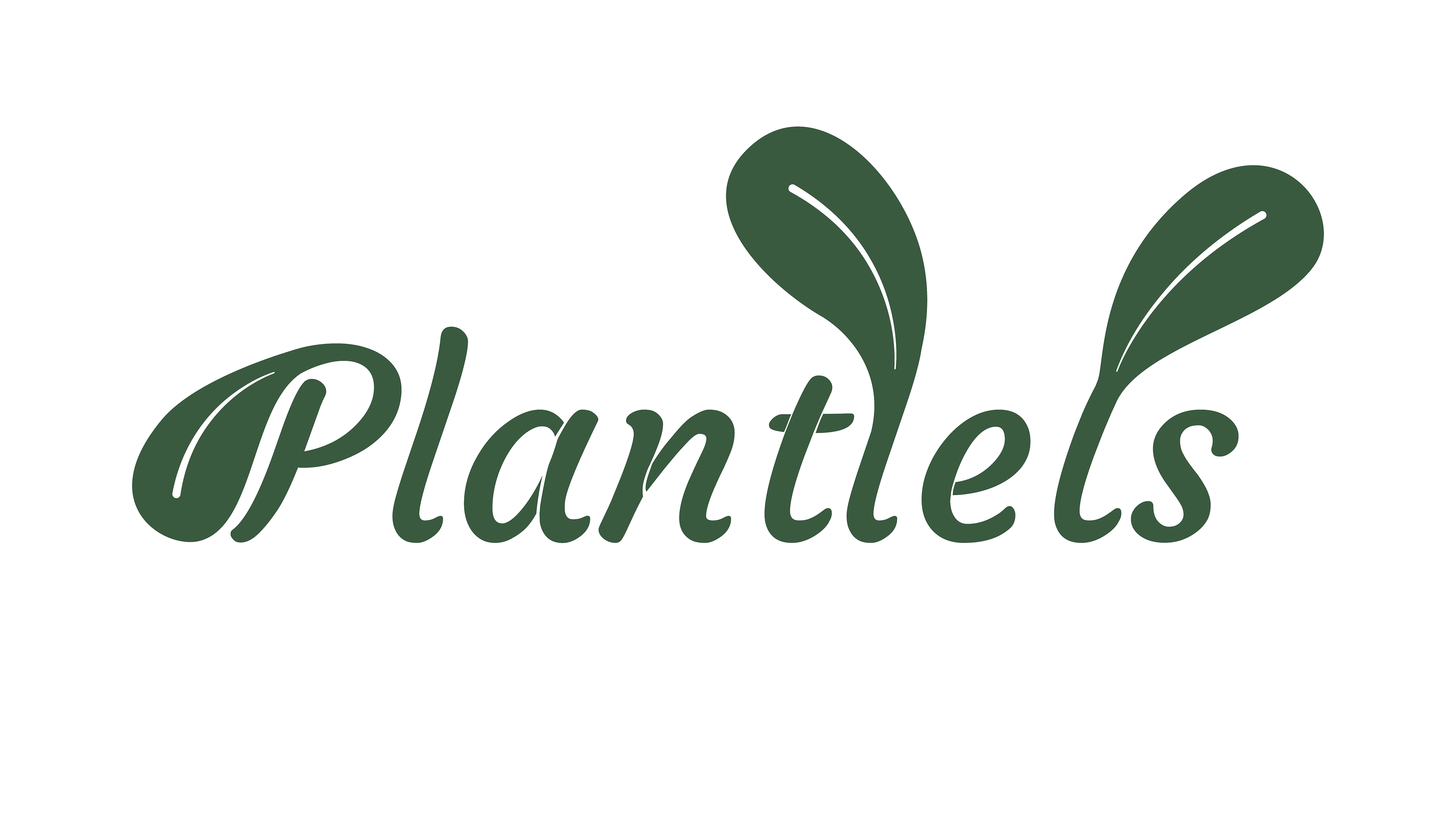
Final Iteration
Finally, after some refinement and colour I ended up on this final iteration of the logo, which I feel is the strongest choice out of the ideation stage and became more unique after I refined the colour palette and modified the typeface.
Final Iteration
Finally, after some refinement and colour I ended up on this final iteration of the logo, which I feel is the strongest choice out of the ideation stage and became more unique after I refined the colour palette and modified the typeface.
____________
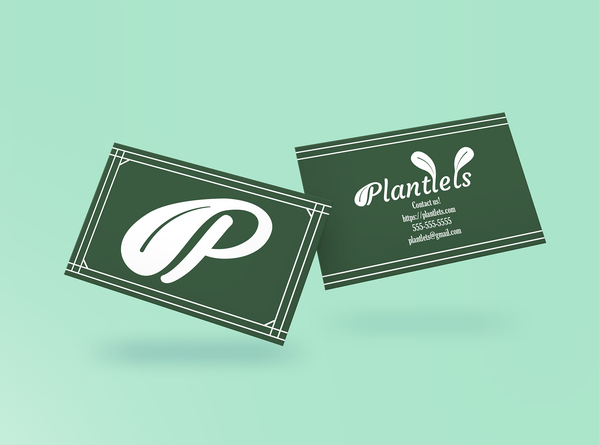
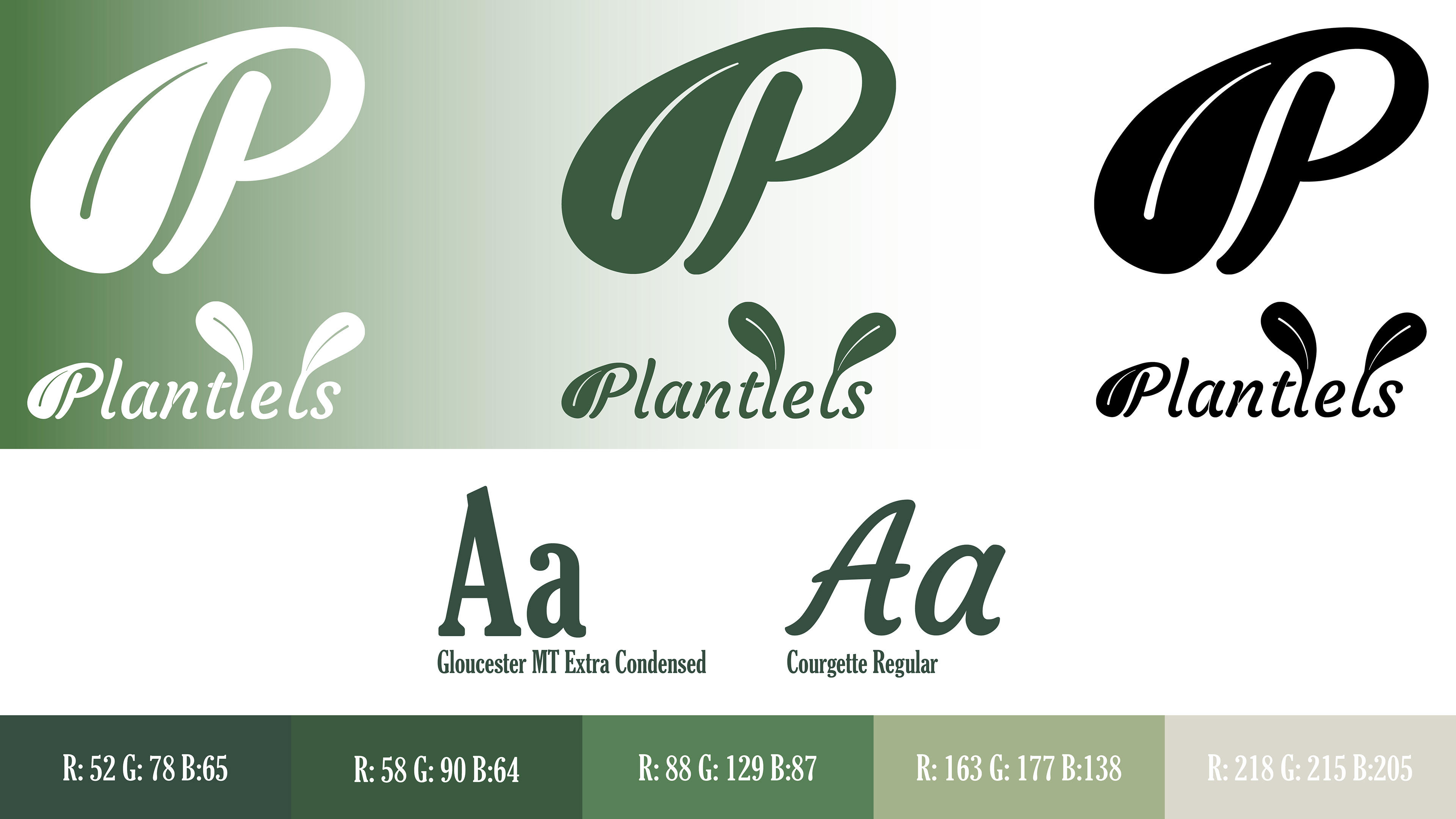
Brand Identity
The brand identity follows a nature approach by combining leaves with the wordmark, allowing for a script typeface such as Courgette Regular to shine. Furthermore, the "P" with the leaf ended up being the focal point of the Logo as this is what I believe to be the most striking aspect of the wordmark and can work as a separate asset on smaller products such as pins or cards.
_______
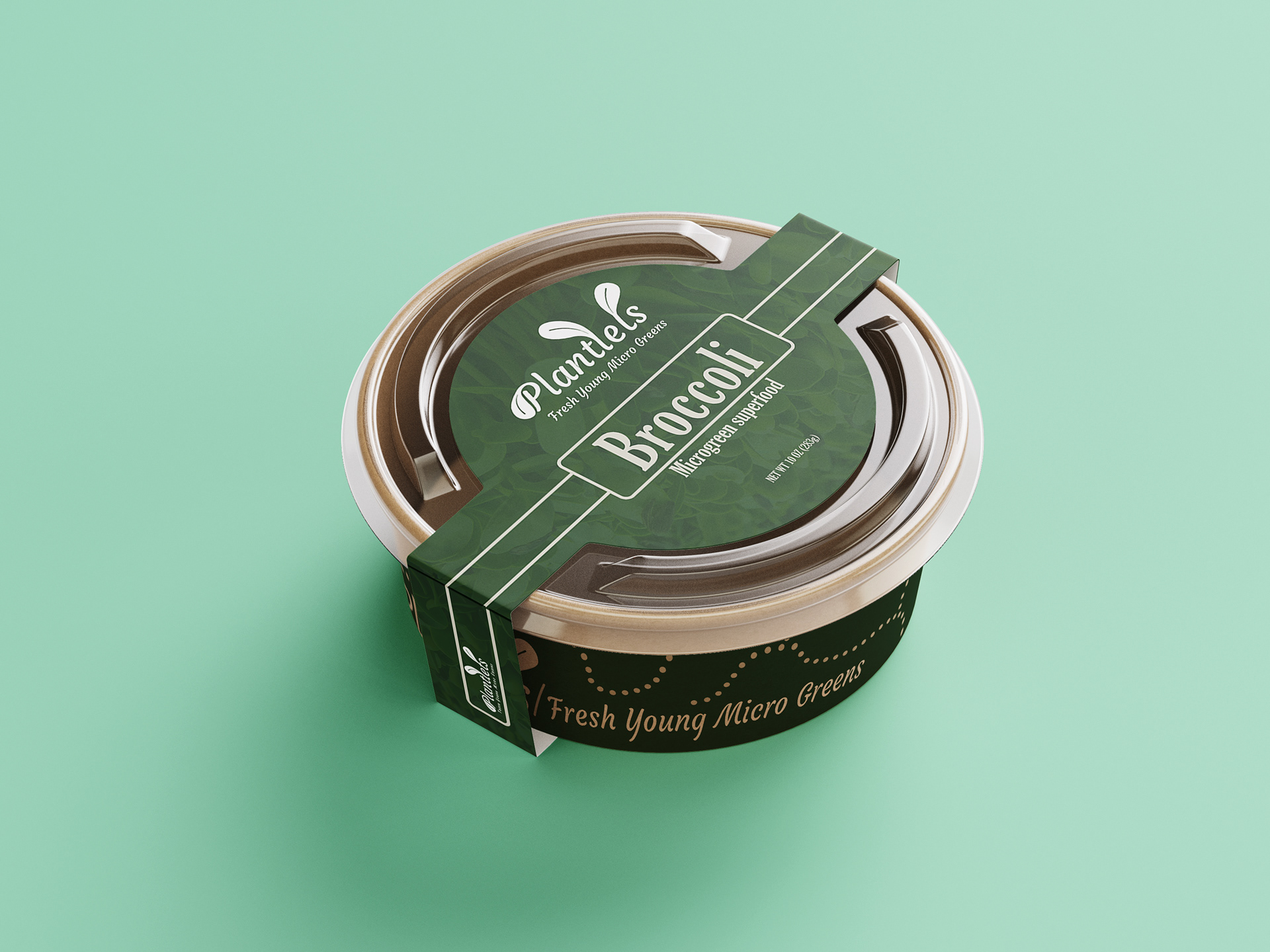
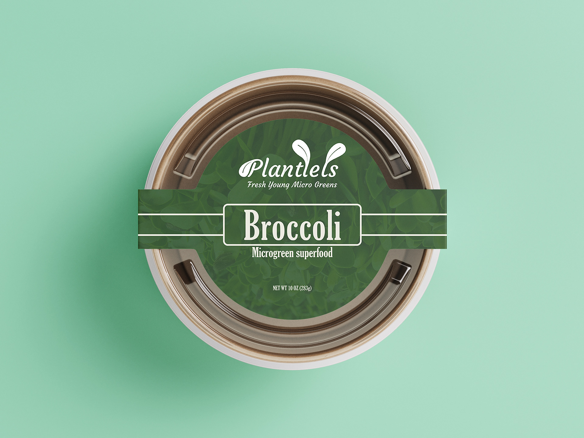
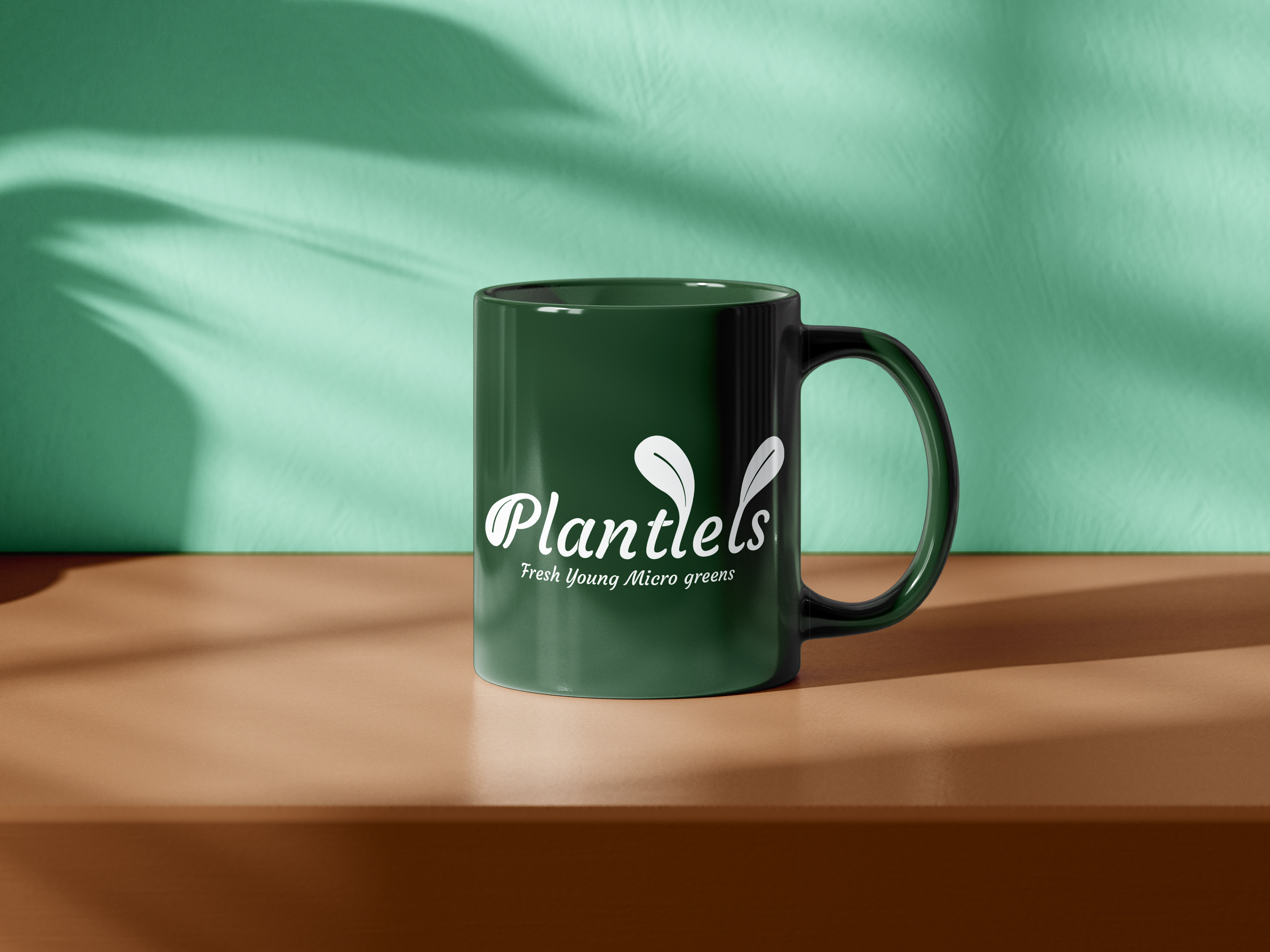
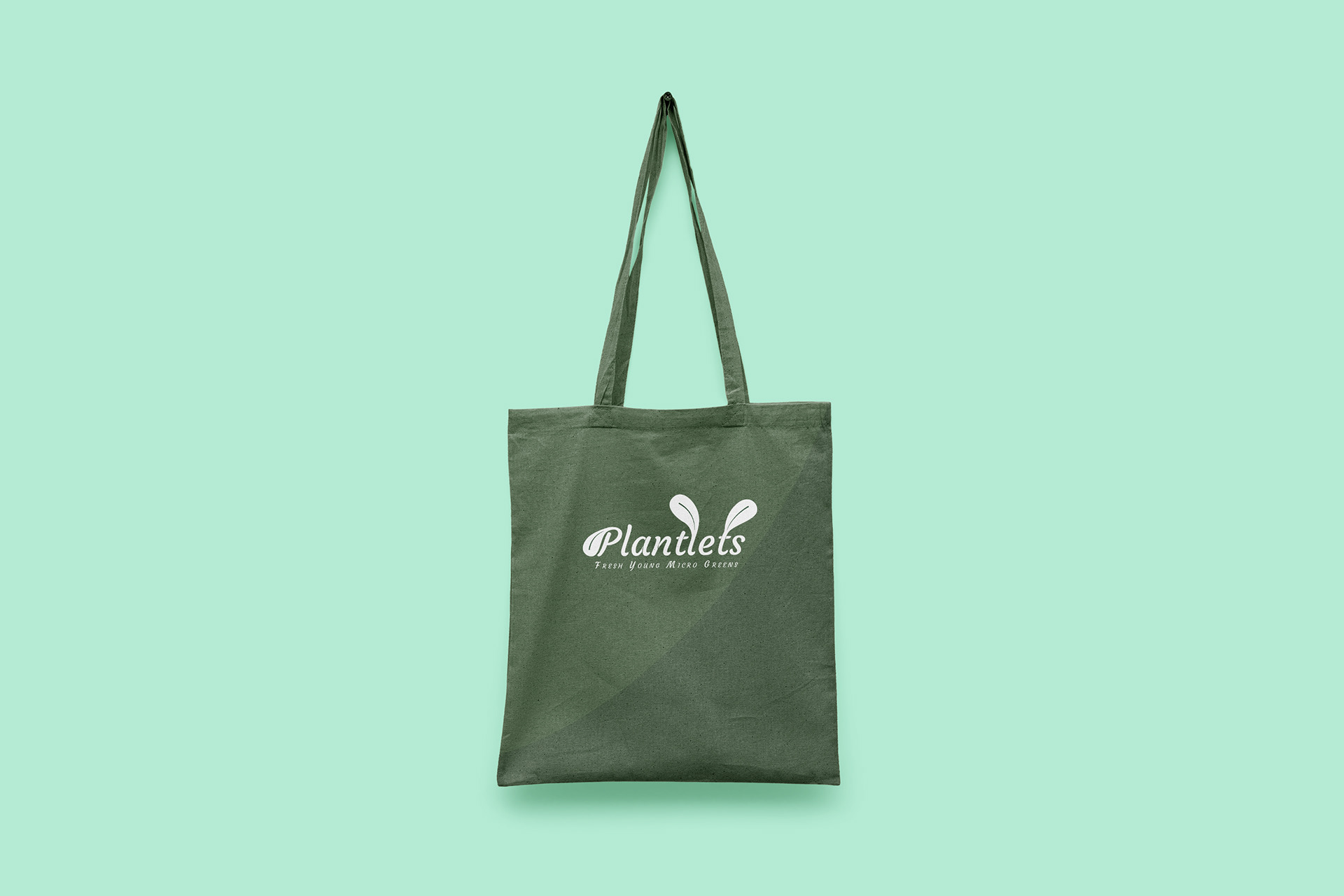
Mockups
One microgreen package (Broccoli) as well as a mug, tote bag, cards and pins as a proof of concept for the brand suite, the packaging can be modified depending on the type of microgreen being sold.
Mockups
One microgreen package (Broccoli) as well as a mug, tote bag, cards and pins as a proof of concept for the brand suite, the packaging can be modified depending on the type of microgreen being sold.