bASED oRIGINS | bRANDING + Packaging
Based Origins is a company dedicated to simplicity. With so many contradictory opinions in the health and wellness space, being healthy has become more and more complicated. They're cutting through the noise by making the simplest "all-in-one" supplement that addresses the fundamental needs of your body.
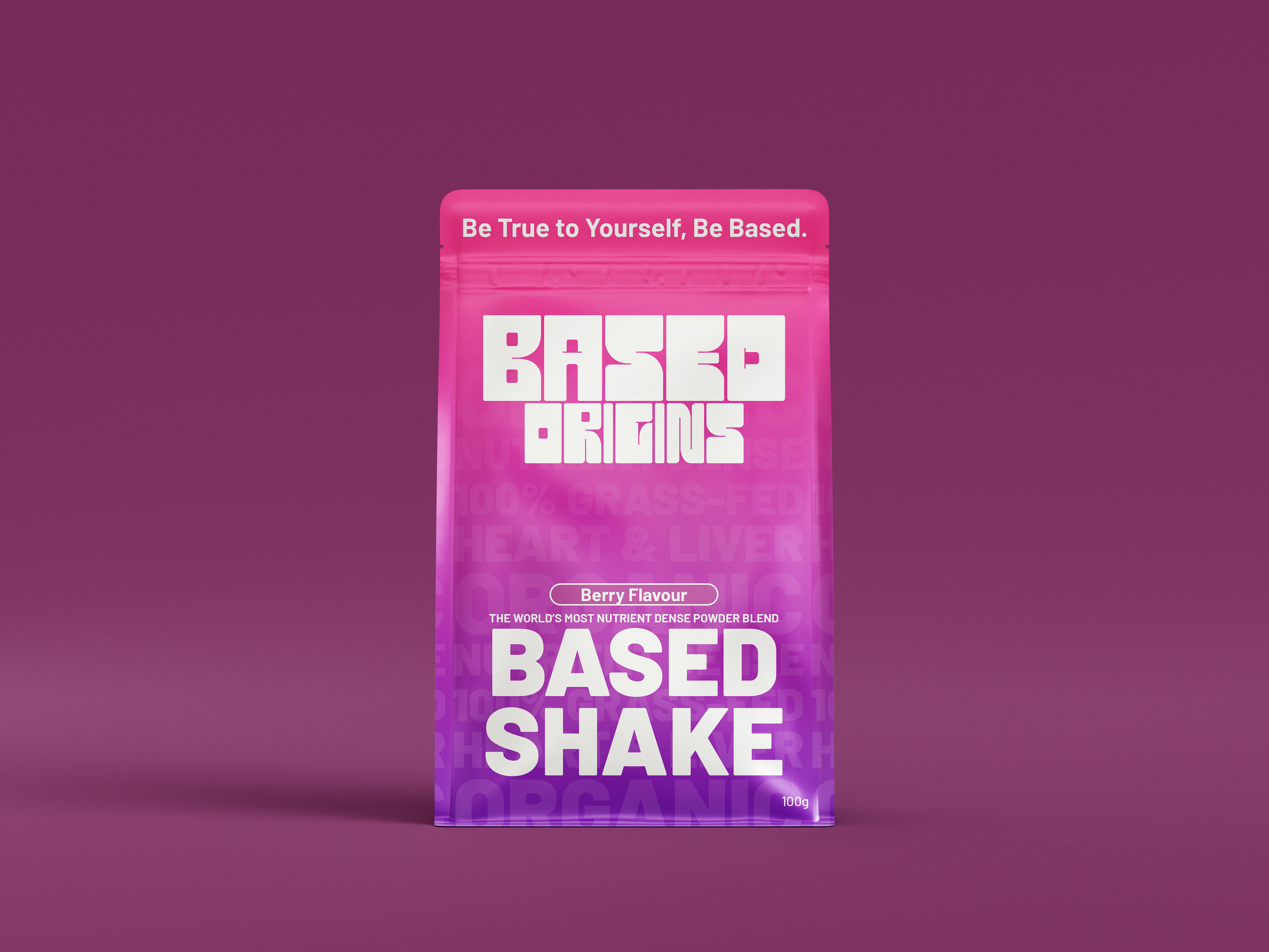
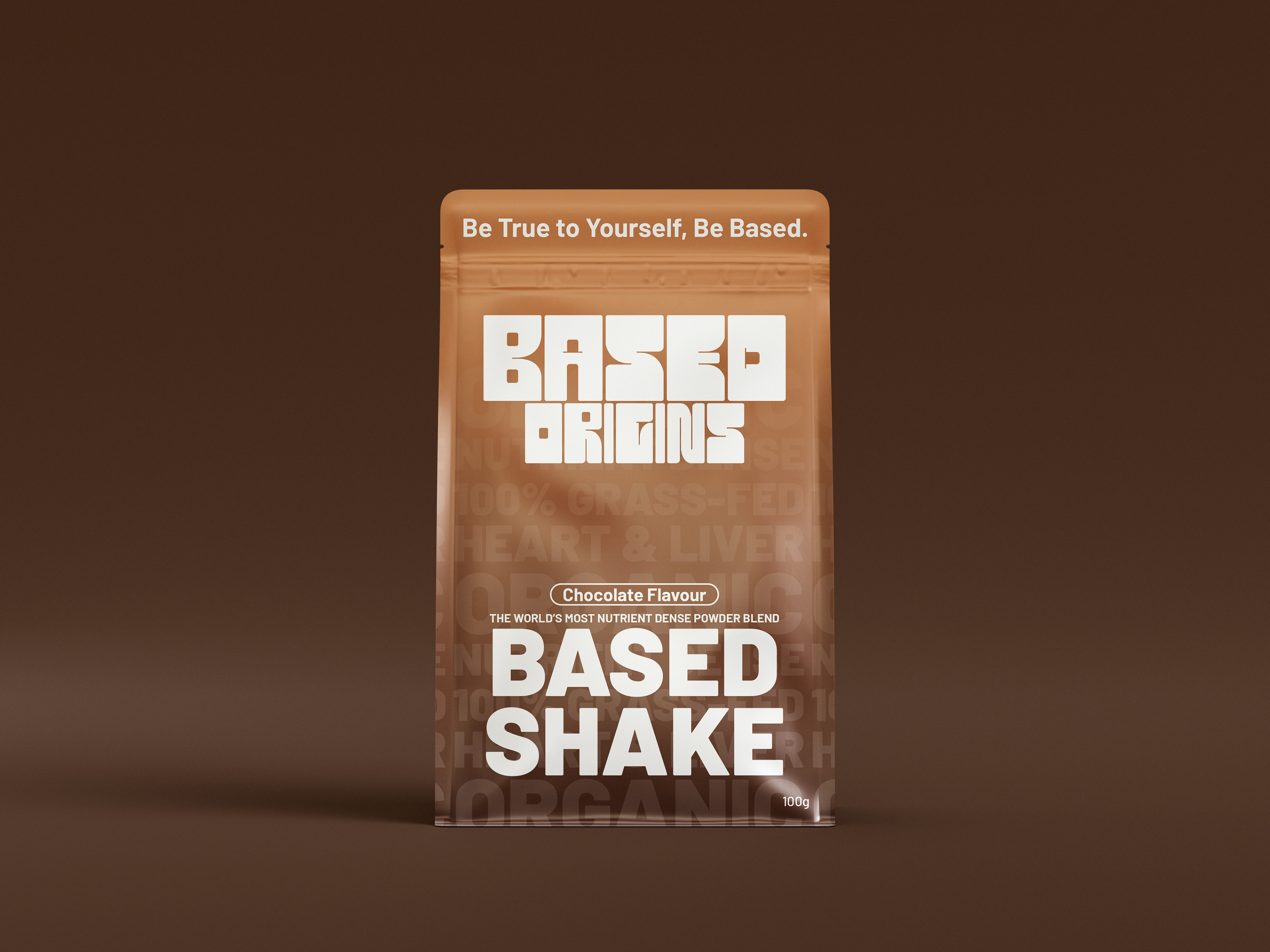
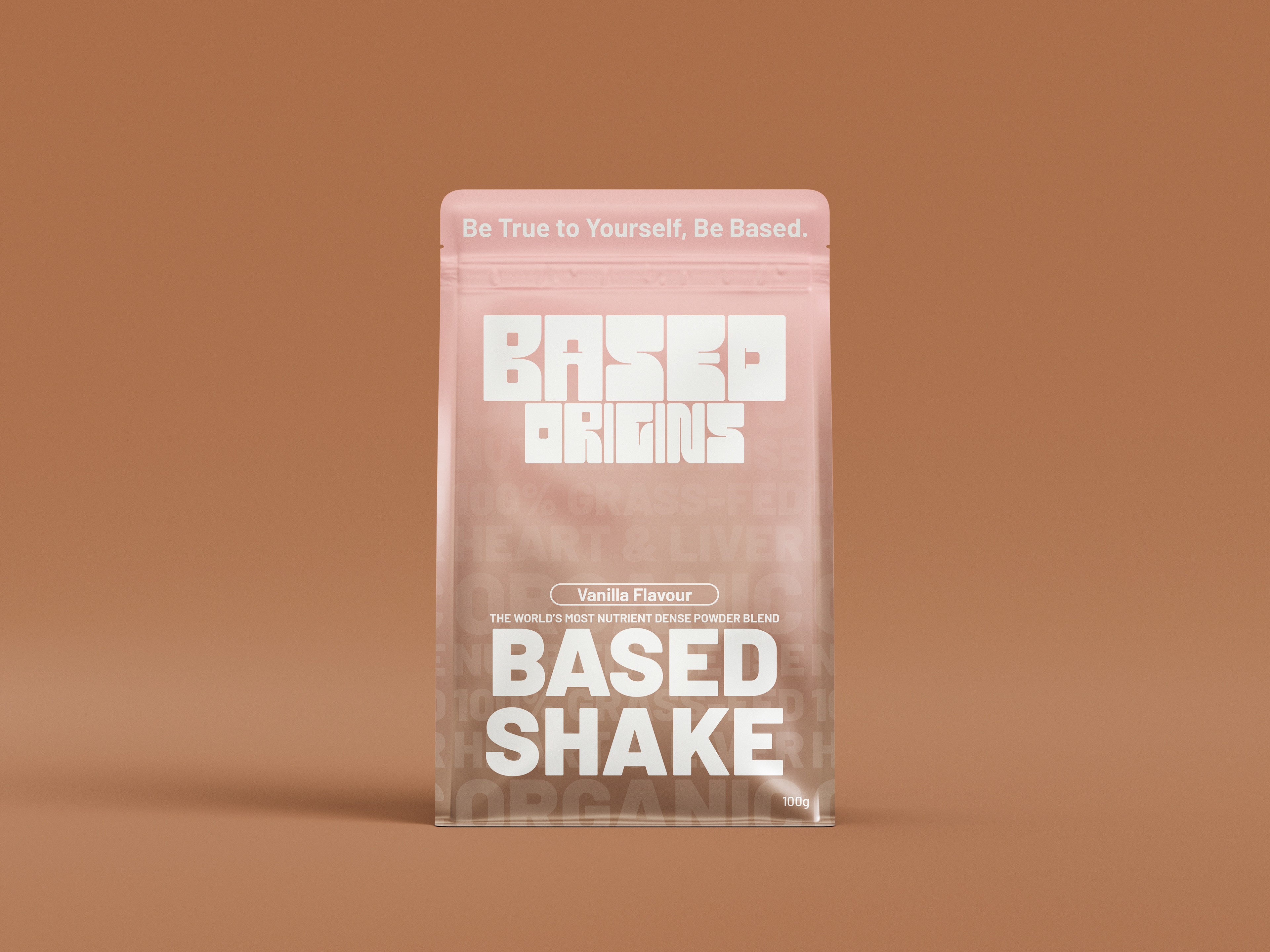
The client requested a full brand identity surrounding the concept of "being based" as well as a standing pouch package for their first product, the "Based Shake".
I designed 3 flavours for their first product to complete the brand suite.
Themes:
Bold
Based
Extraordinary
Bold
Based
Extraordinary
________________
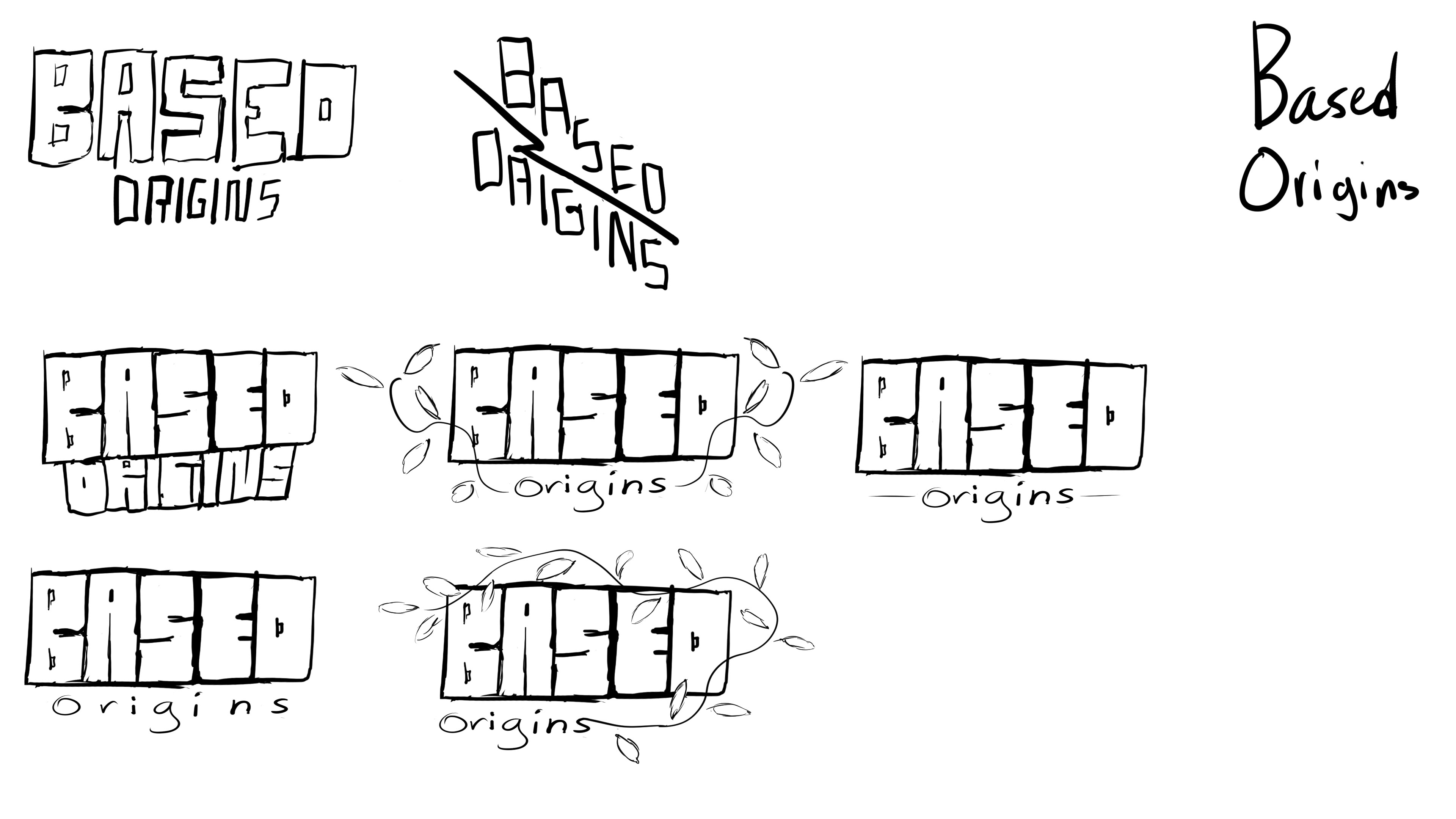
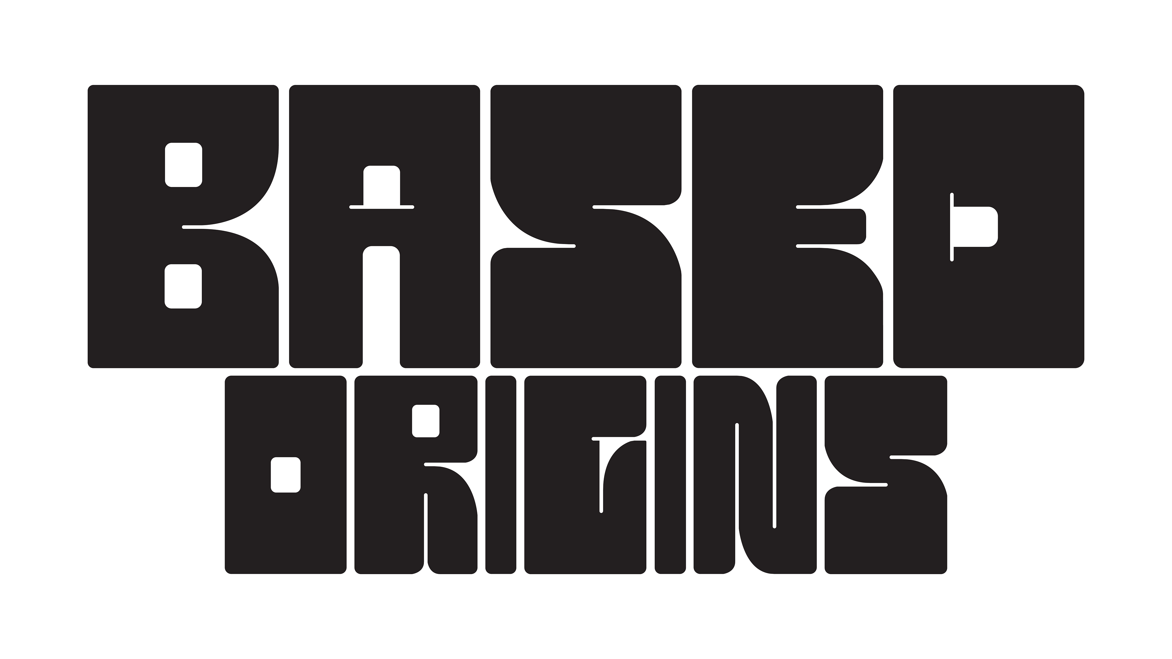
Sketches & Ideations
Sketching for this client was a simpler process than expected due to them already providing 2 mood boards to draw inspiration from. My ideation process naturally led me to a more aggressive and "in your face" kind of typography to match their bold approach.
Sketches & Ideations
Sketching for this client was a simpler process than expected due to them already providing 2 mood boards to draw inspiration from. My ideation process naturally led me to a more aggressive and "in your face" kind of typography to match their bold approach.
However, the original sketches didn't translate very well to packaging due to the tight spacing and heavy use of rectangles, making it unreadable when viewed at a glance.
____________
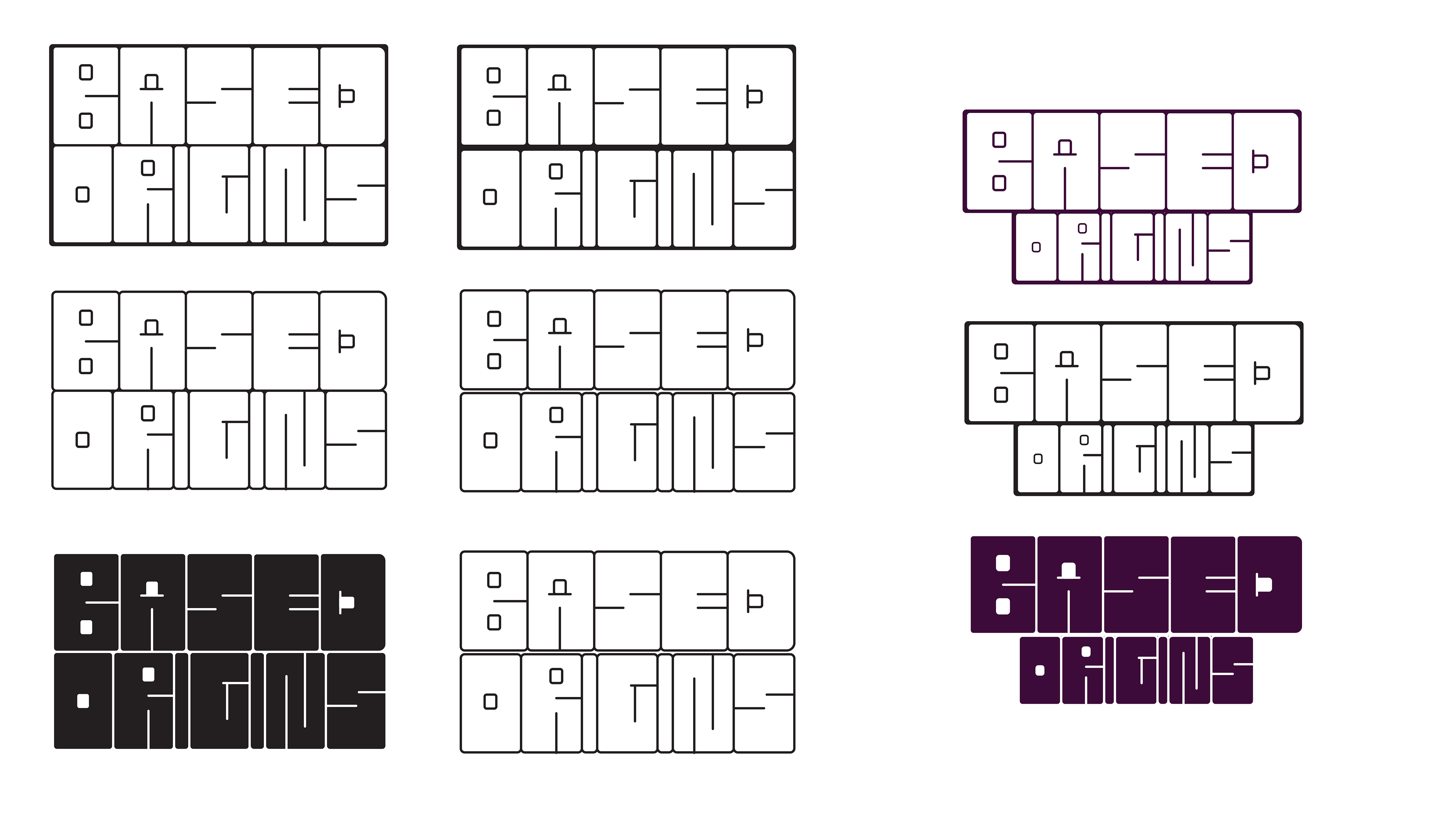
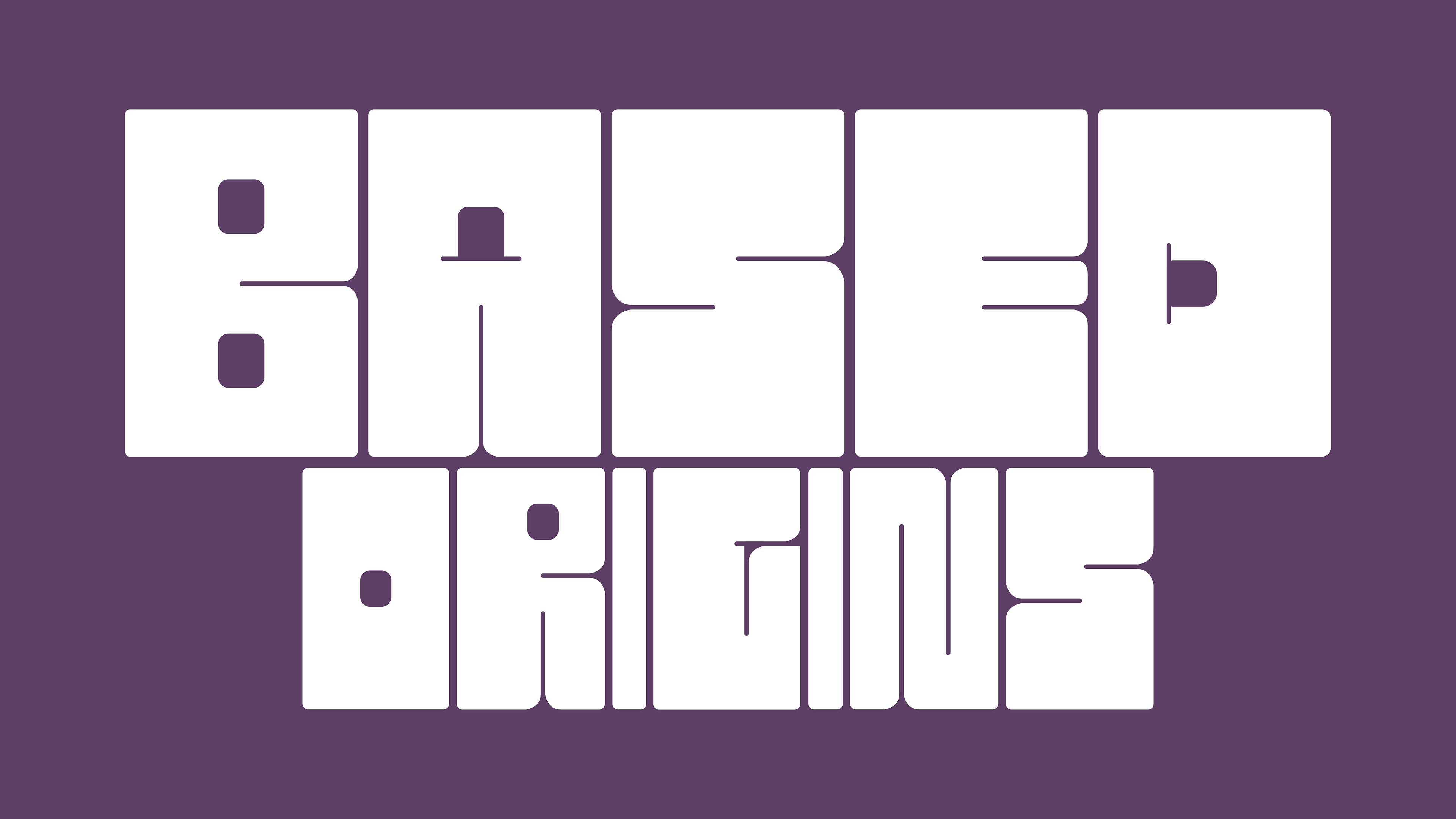
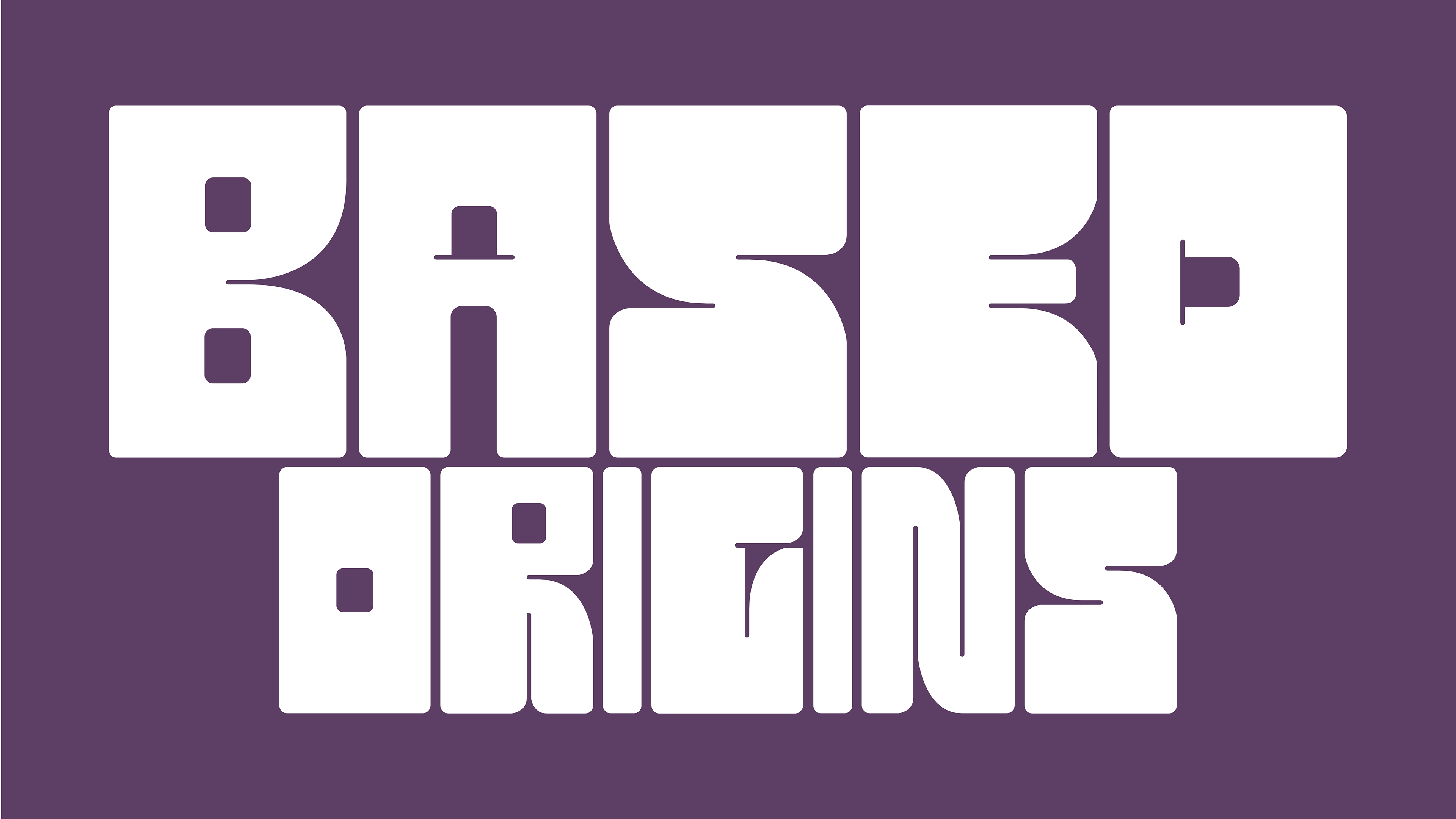
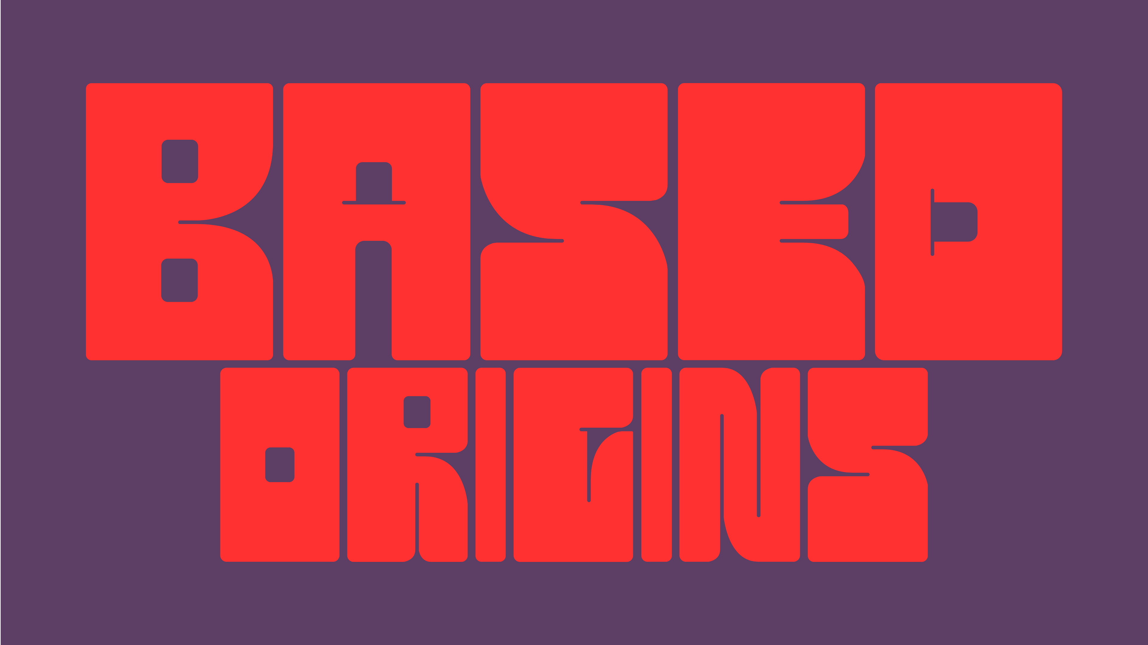
Final Iteration
After some refinement, I reached a result that improves readability at a glance while also keeping and improving on the bold and "based" feeling. I used some clever spacing and exaggerated curves to make the text less boxy and more readable as text both at a glance and on the packaging.
_______
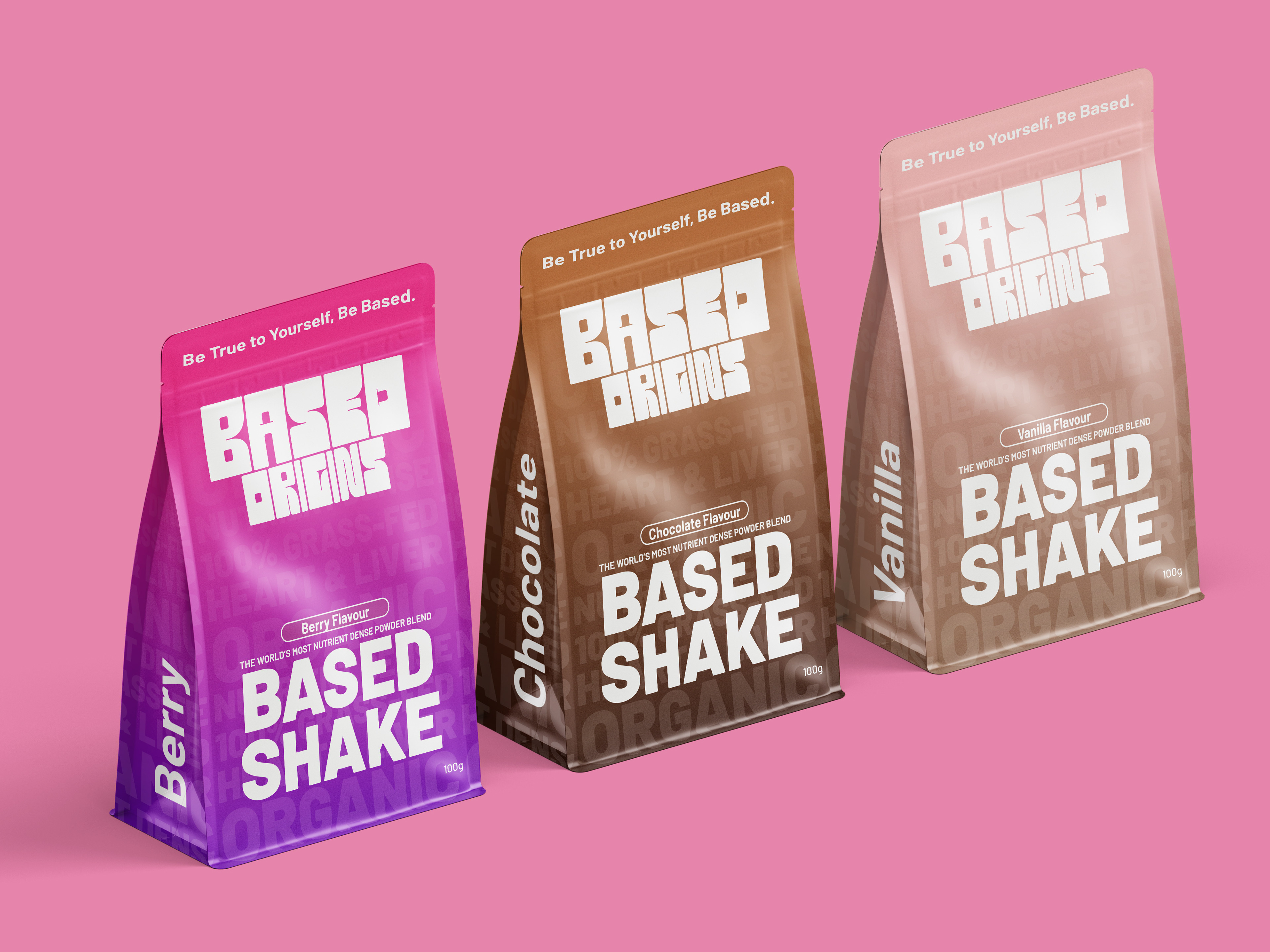
Mockups
Here are 3 variations of the Based Shake powder blend as well as a mockup showcasing all 3 together.
Mockups
Here are 3 variations of the Based Shake powder blend as well as a mockup showcasing all 3 together.