
Shift 22 | Branding Design
The fictional Shift 22 conference is a gathering of intellectual individuals who want to spread their knowledge and ideas to create positive change in society and technology, The brief requested both a logo as well as multiple types of marketing materials for use.
Shift 22 was a challenge for me as it required a lot of trial and error to get the feeling of the conference put into the logo and poster, but ultimately became one of my better projects and showcased consistency in my design skills.
Themes:
Influential
Power
Discussion
Influential
Power
Discussion
_______________
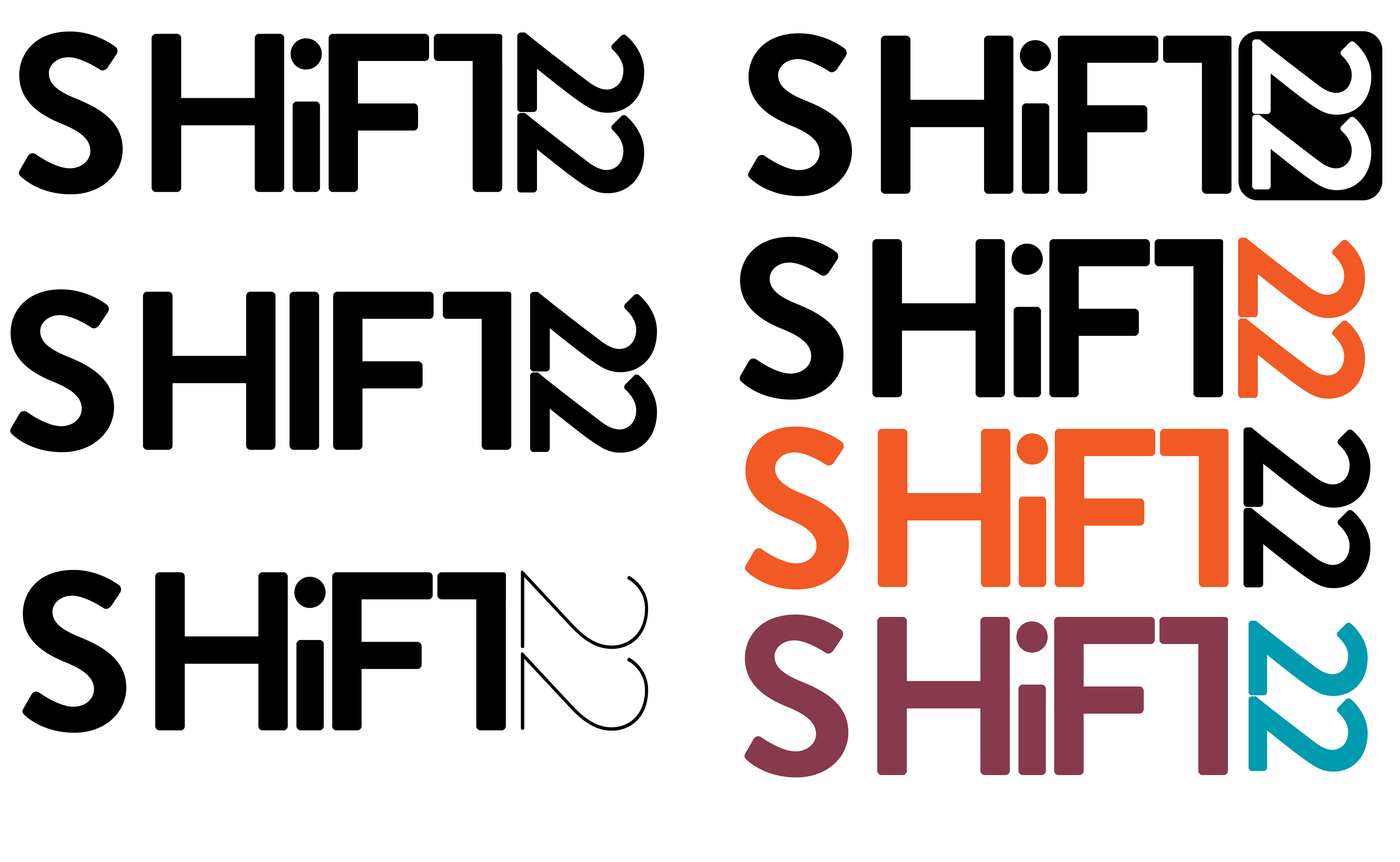
Sketches & Ideations
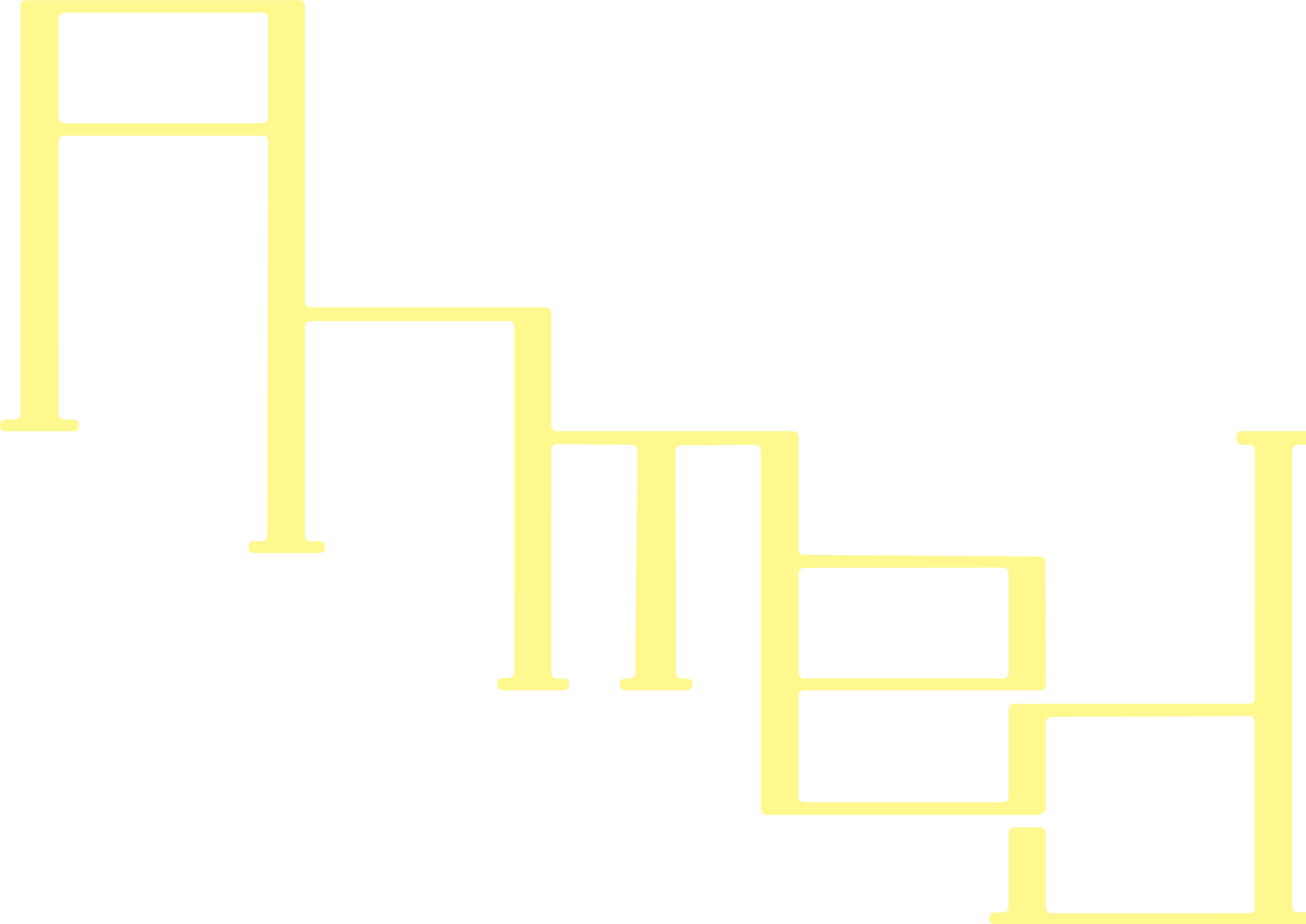
The Shift 22 logo combines the themes of intellectual discussion being shared in the conference, with the modern and innovative mentality that went into the creation of the event. Due to this, I decided to opt for a refined logo using the classic "i" for intelligence, while also shifting the 22 to align with the T as a sign of change or "shifting the scale" per se. The number is adjustable to whichever year the conference is held.
Sketches & Ideations
The Shift 22 logo combines the themes of intellectual discussion being shared in the conference, with the modern and innovative mentality that went into the creation of the event. Due to this, I decided to opt for a refined logo using the classic "i" for intelligence, while also shifting the 22 to align with the T as a sign of change or "shifting the scale" per se. The number is adjustable to whichever year the conference is held.

________
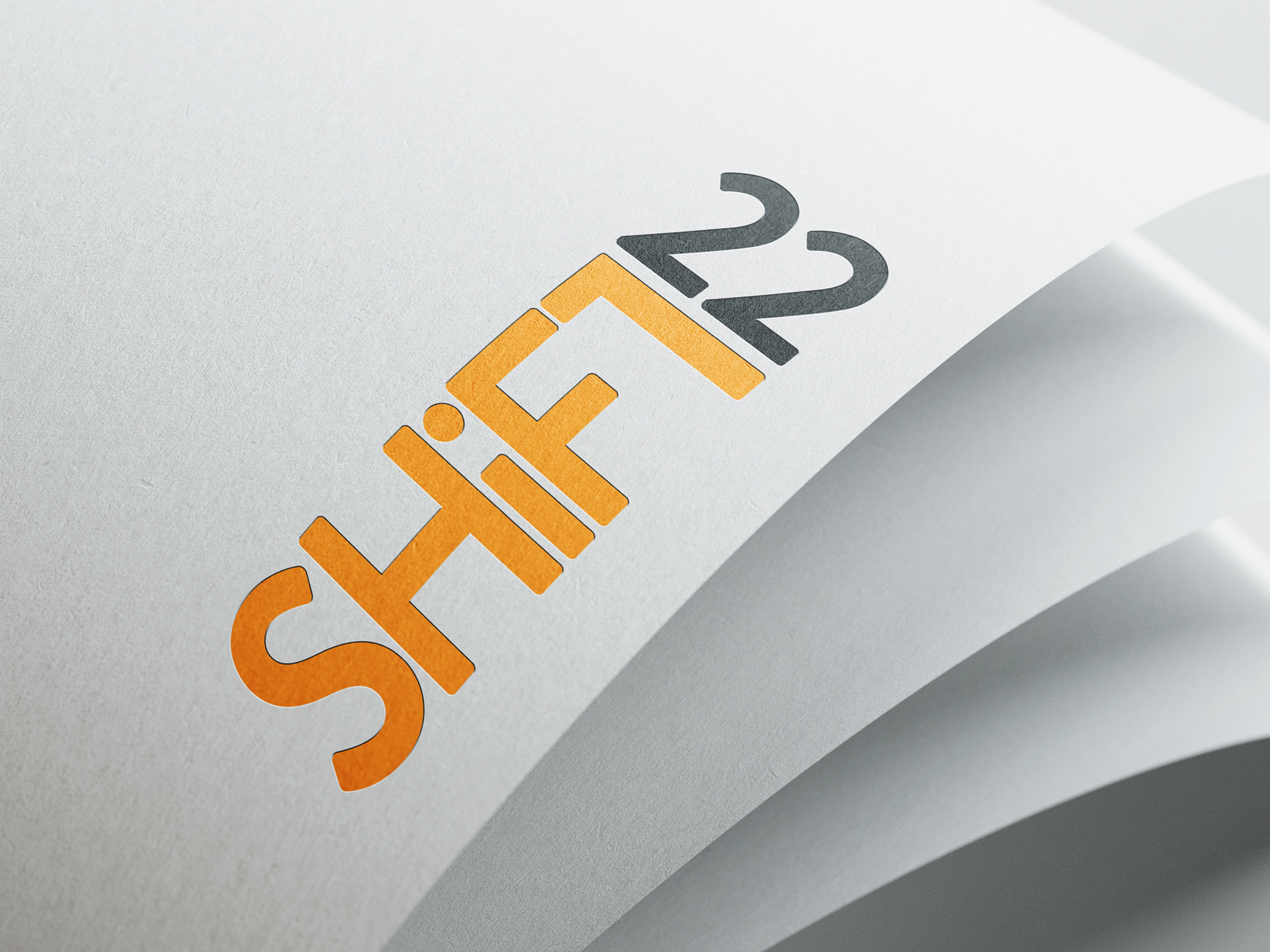
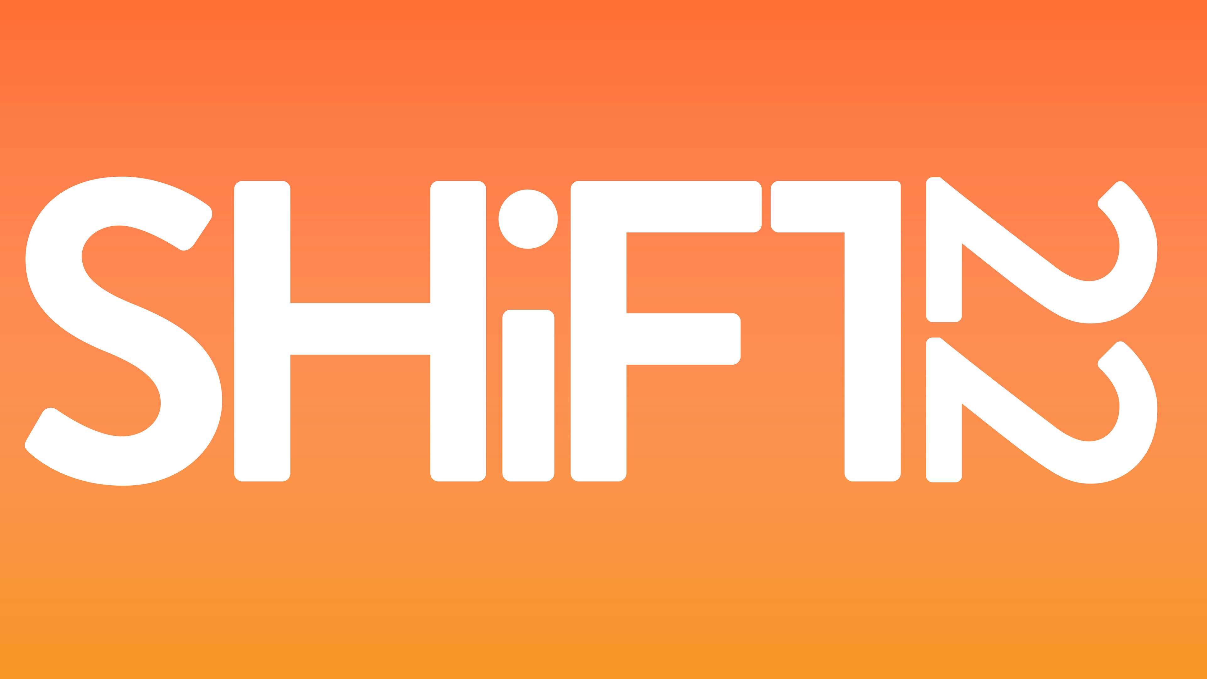
Final Logo
This is ultimately what I decided to go with, as it felt like the best variant out of the ideation stage for use in the rest of the branding. This enabled me to put more focus on the other aspects of the branding that accentuate and amplify the goals of this logo.
Final Logo
This is ultimately what I decided to go with, as it felt like the best variant out of the ideation stage for use in the rest of the branding. This enabled me to put more focus on the other aspects of the branding that accentuate and amplify the goals of this logo.
____________
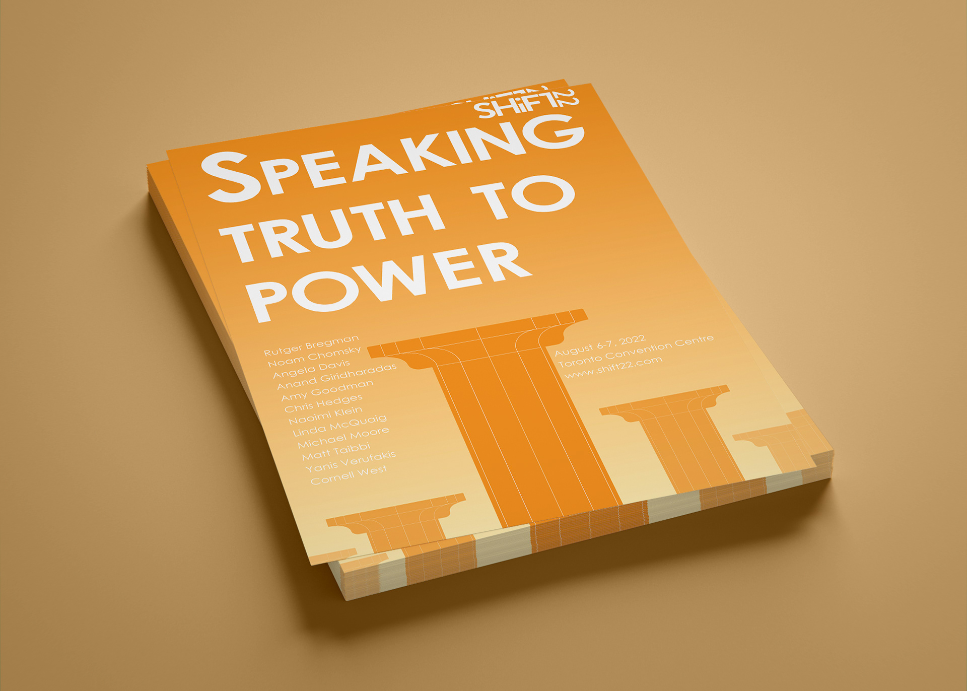
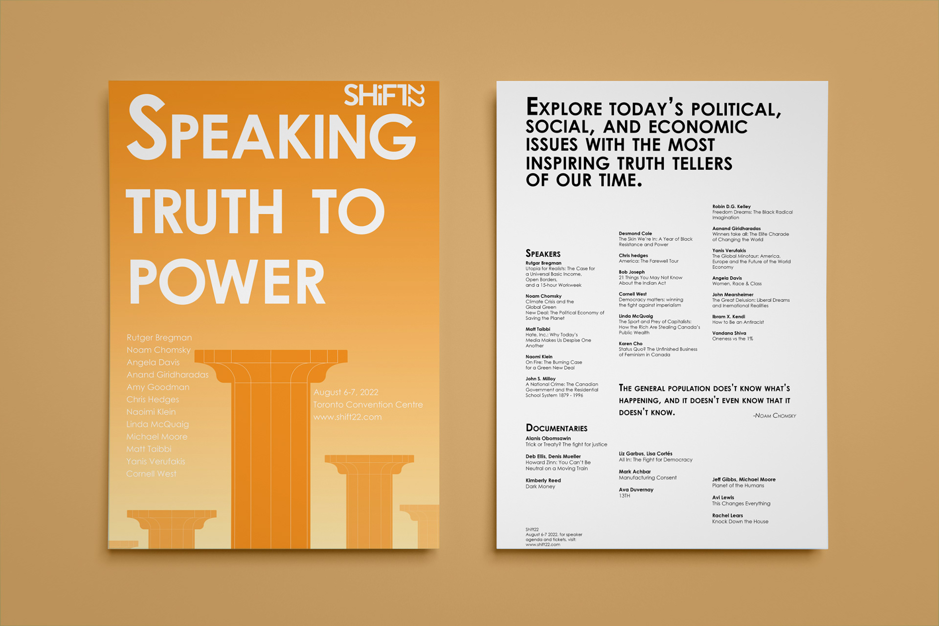
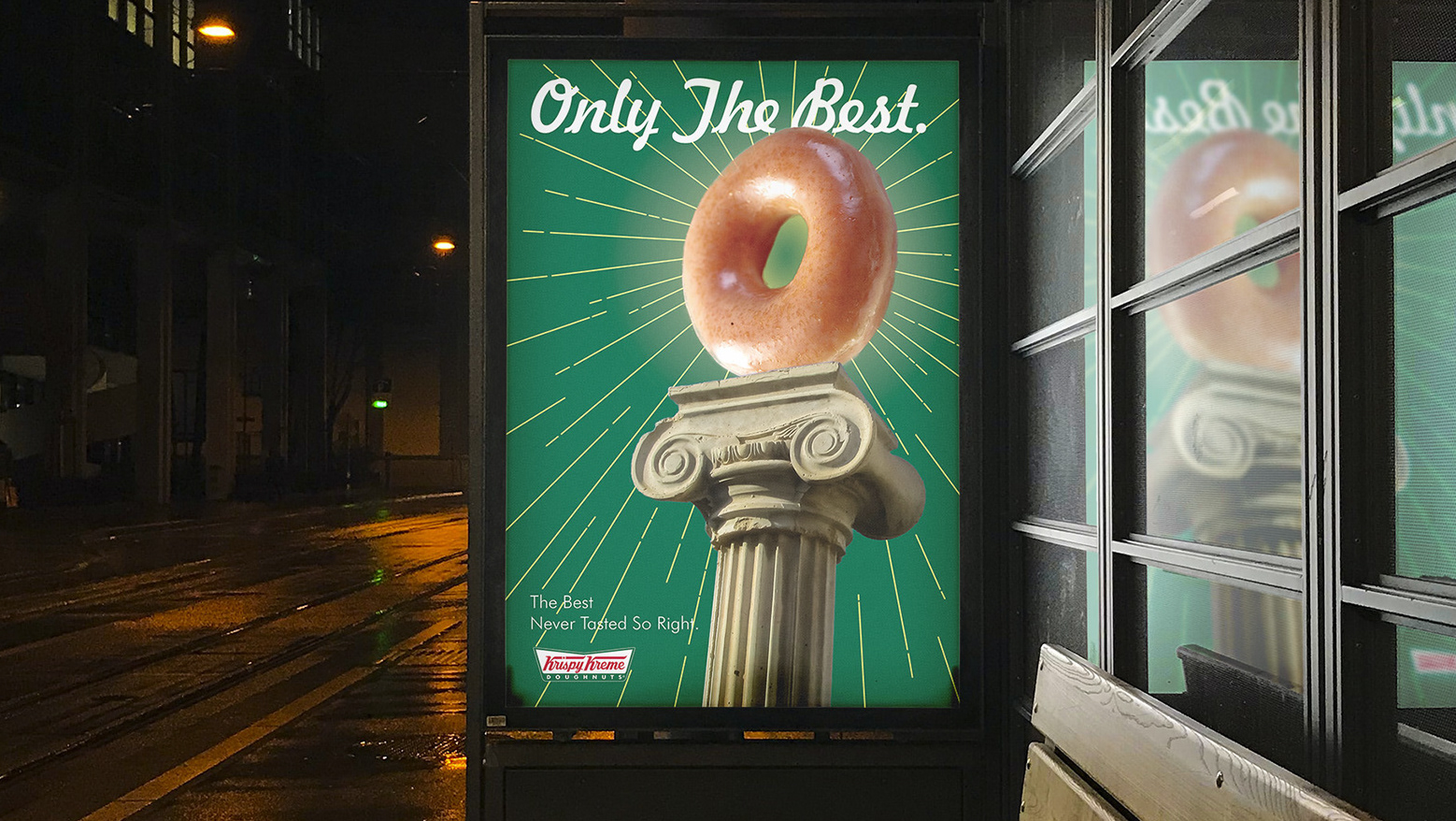
Final Iteration
The symbol of high status/power- the pedestal. This design uses it as a call to action for establishing change using this conference and highlights the need to speak truth to that power in order to enact change in an impactful way.
Final Iteration
The symbol of high status/power- the pedestal. This design uses it as a call to action for establishing change using this conference and highlights the need to speak truth to that power in order to enact change in an impactful way.


_______
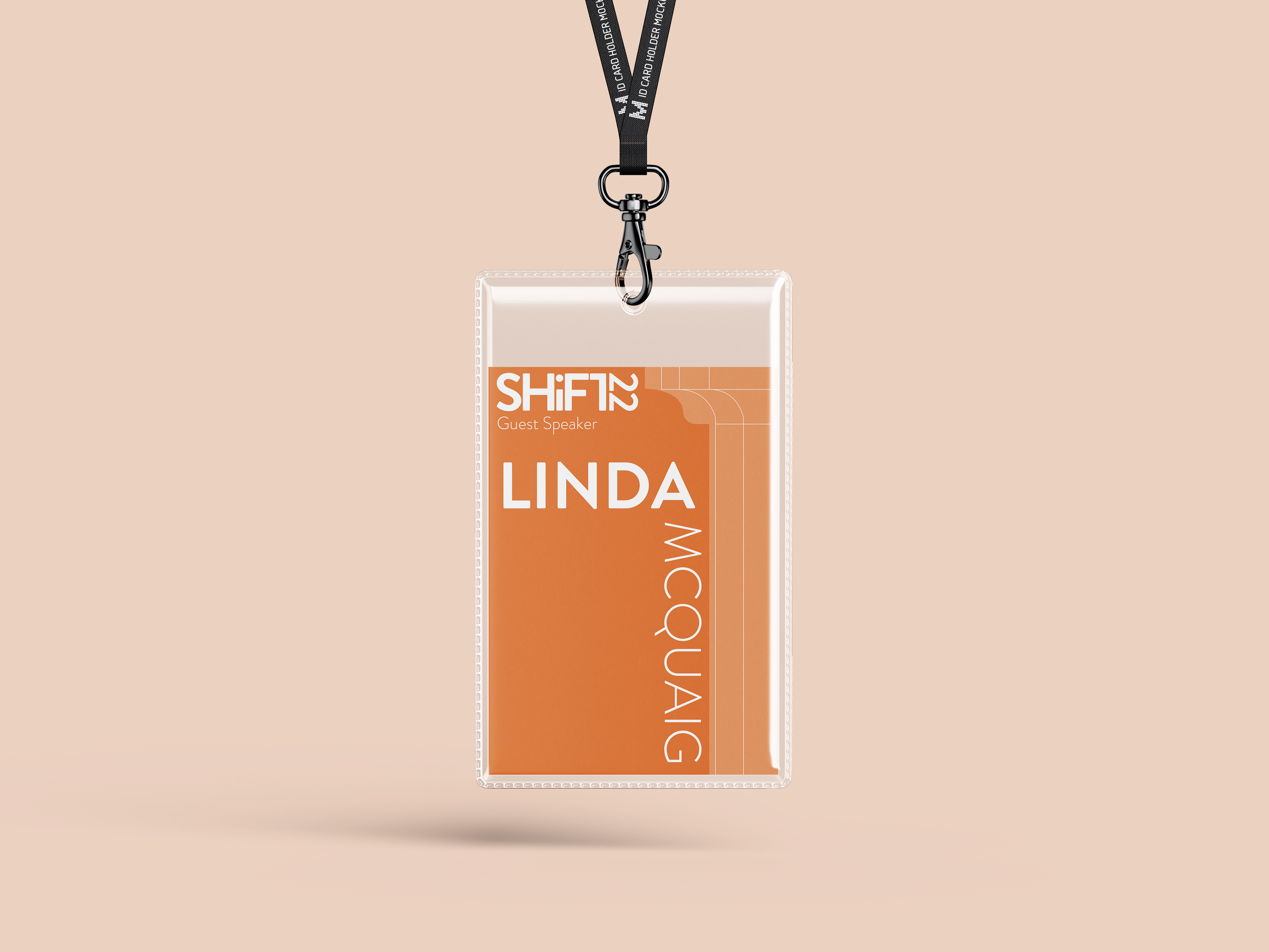
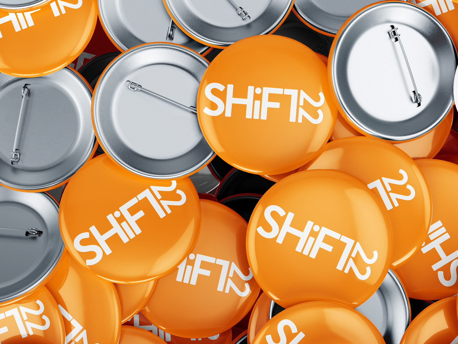
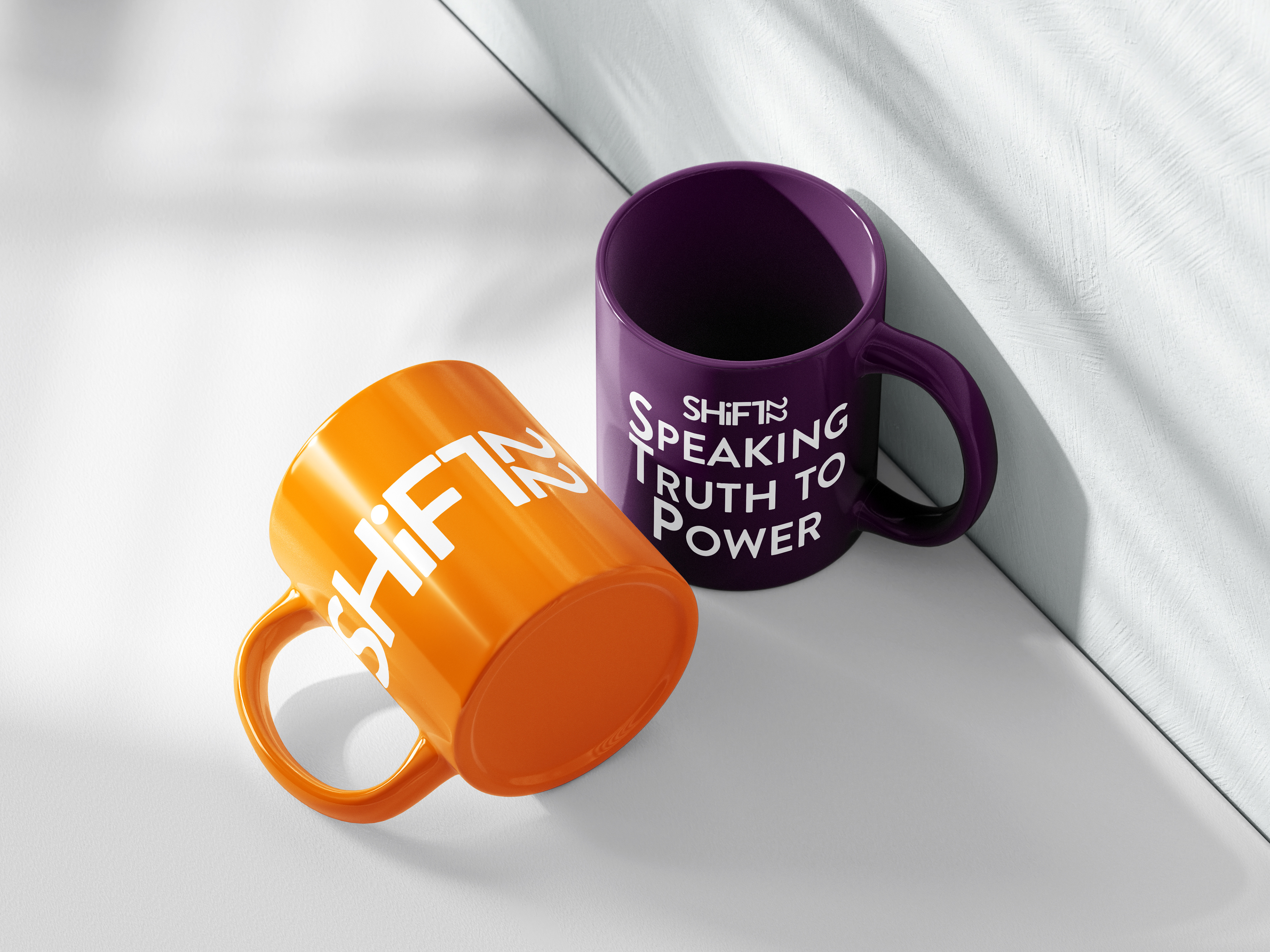
Mockups
Here are some mockups showcasing what some flyers, banners, ID card holders, and more would look like when viewing the conference.
Mockups
Here are some mockups showcasing what some flyers, banners, ID card holders, and more would look like when viewing the conference.