Krispy Kreme | Ad Campaign
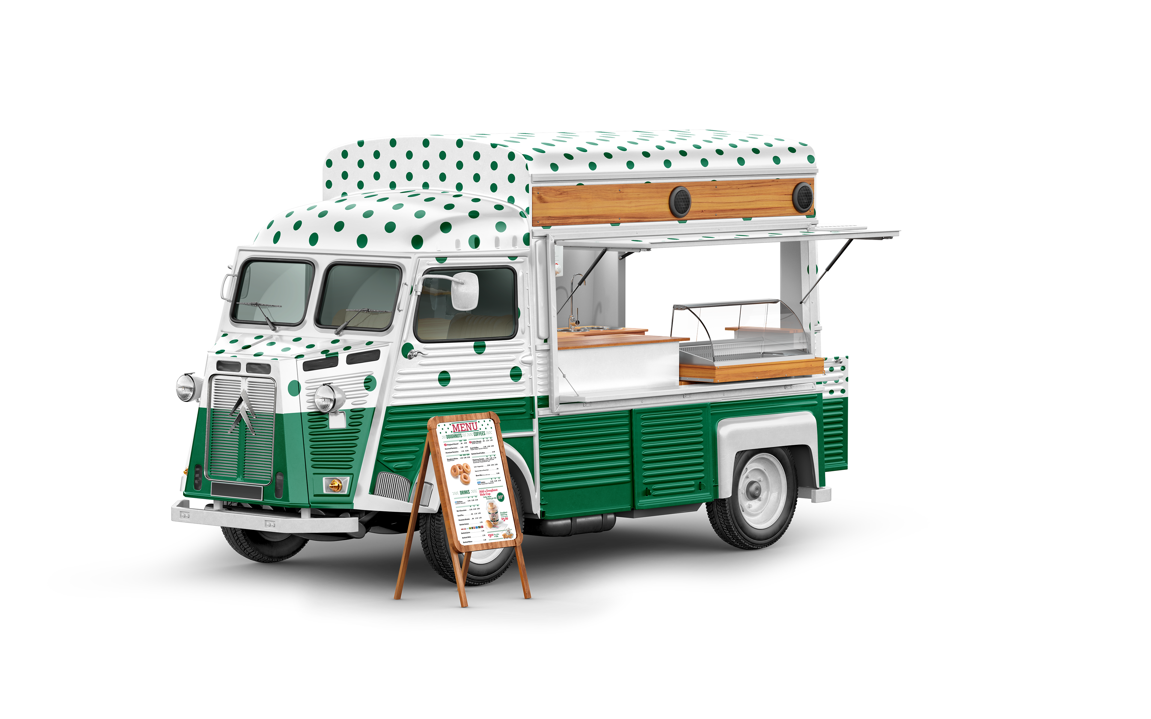
The Brief entailed a three-stage advertising campaign for Krispy Kreme's Donuts that included a donut truck, packaging, and both banner and social media ads.
Themes:Bright
Humble Brag
Fun
________________
Sketches & Ideations
During the sketch phase, I had to deliberate and experiment with the sketches multiple times due to the connection each design has with the tag lines associated. The tag lines are the basis of the campaigns so their association was significant. this was a major challenge that resulted in the set of poster sketches below.
____________
Final Iteration
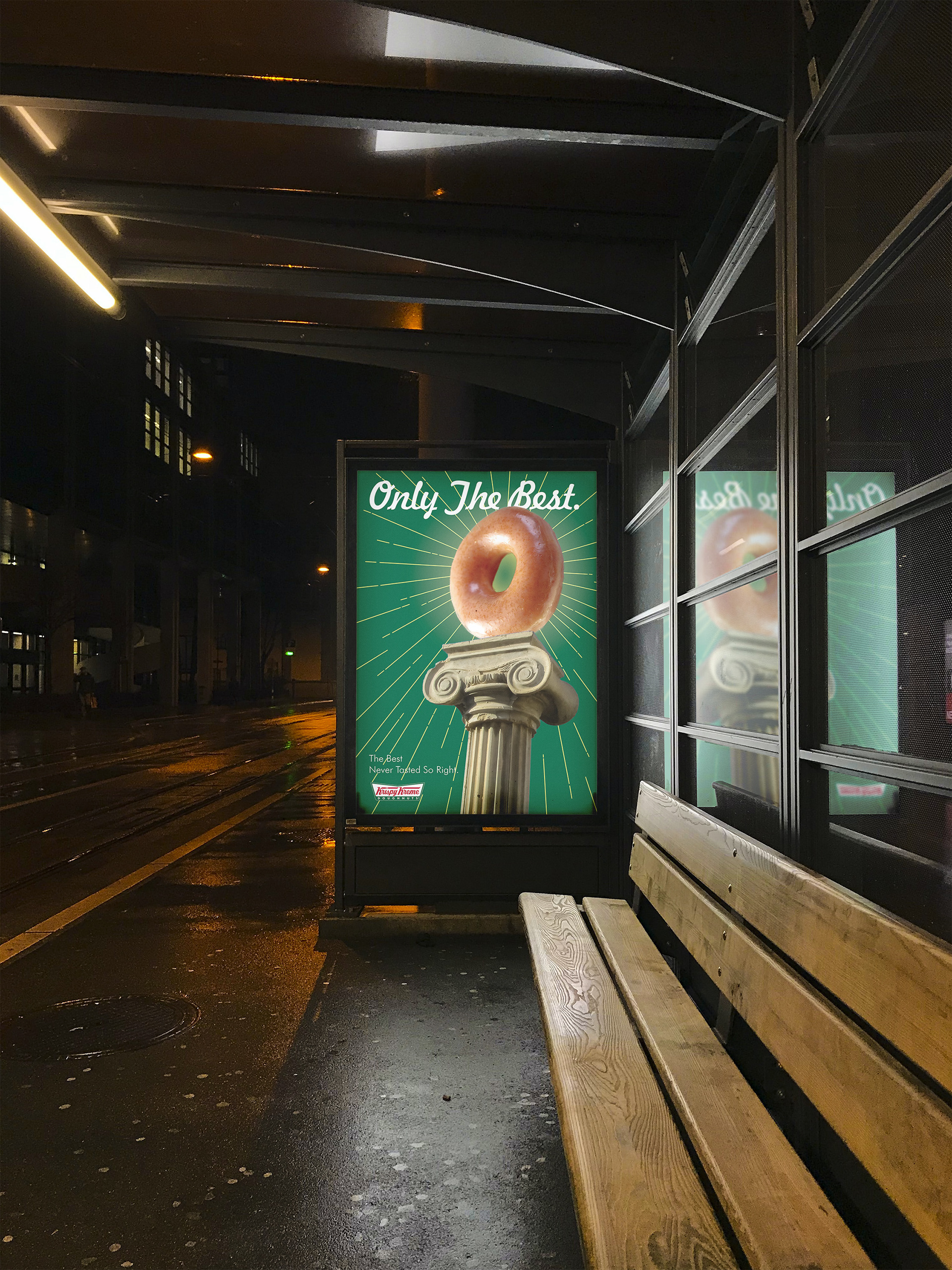
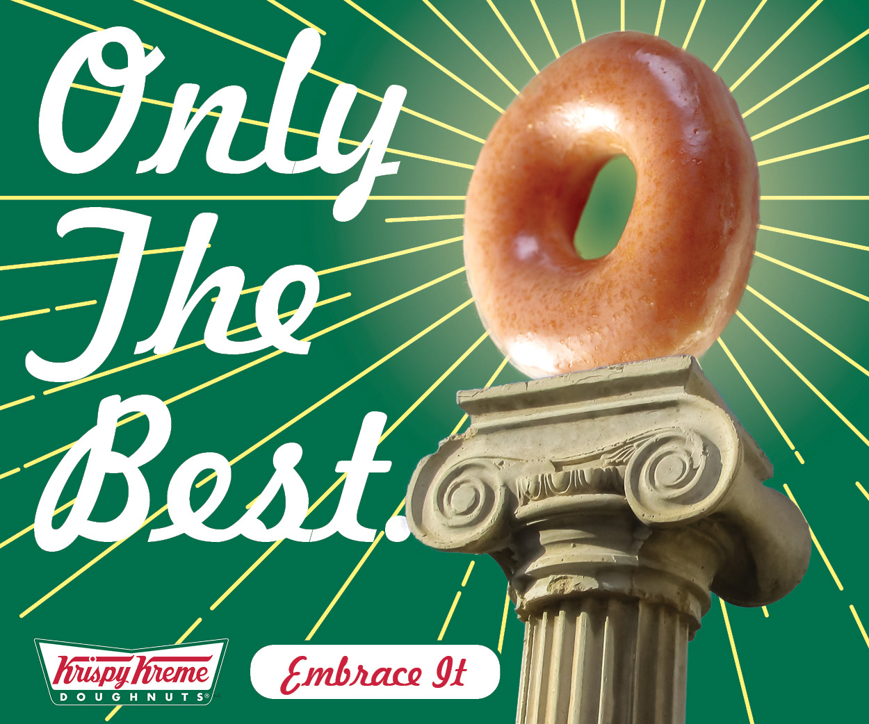
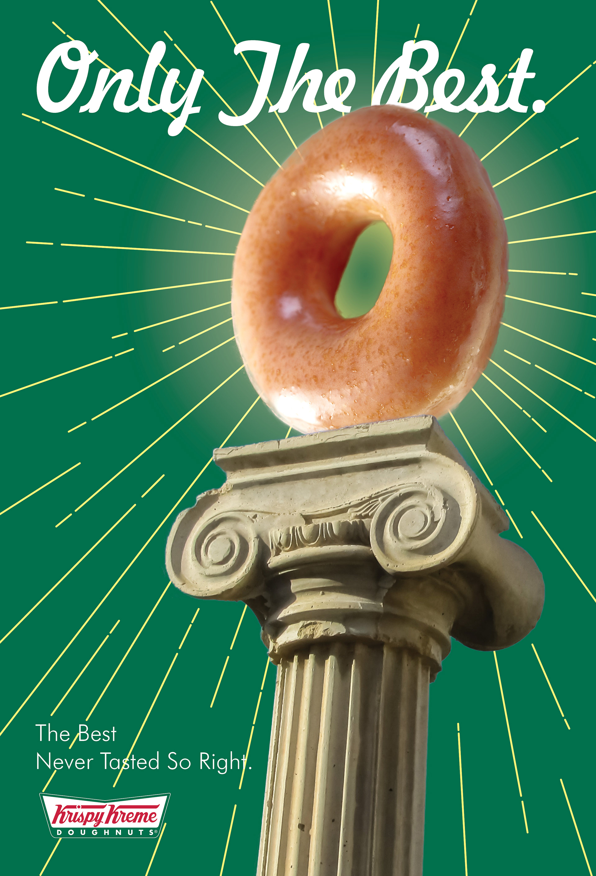
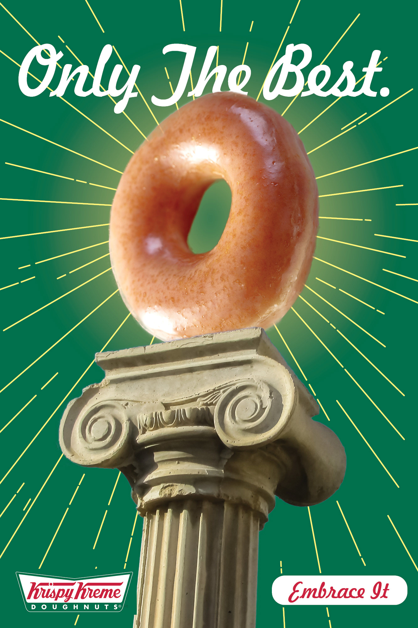
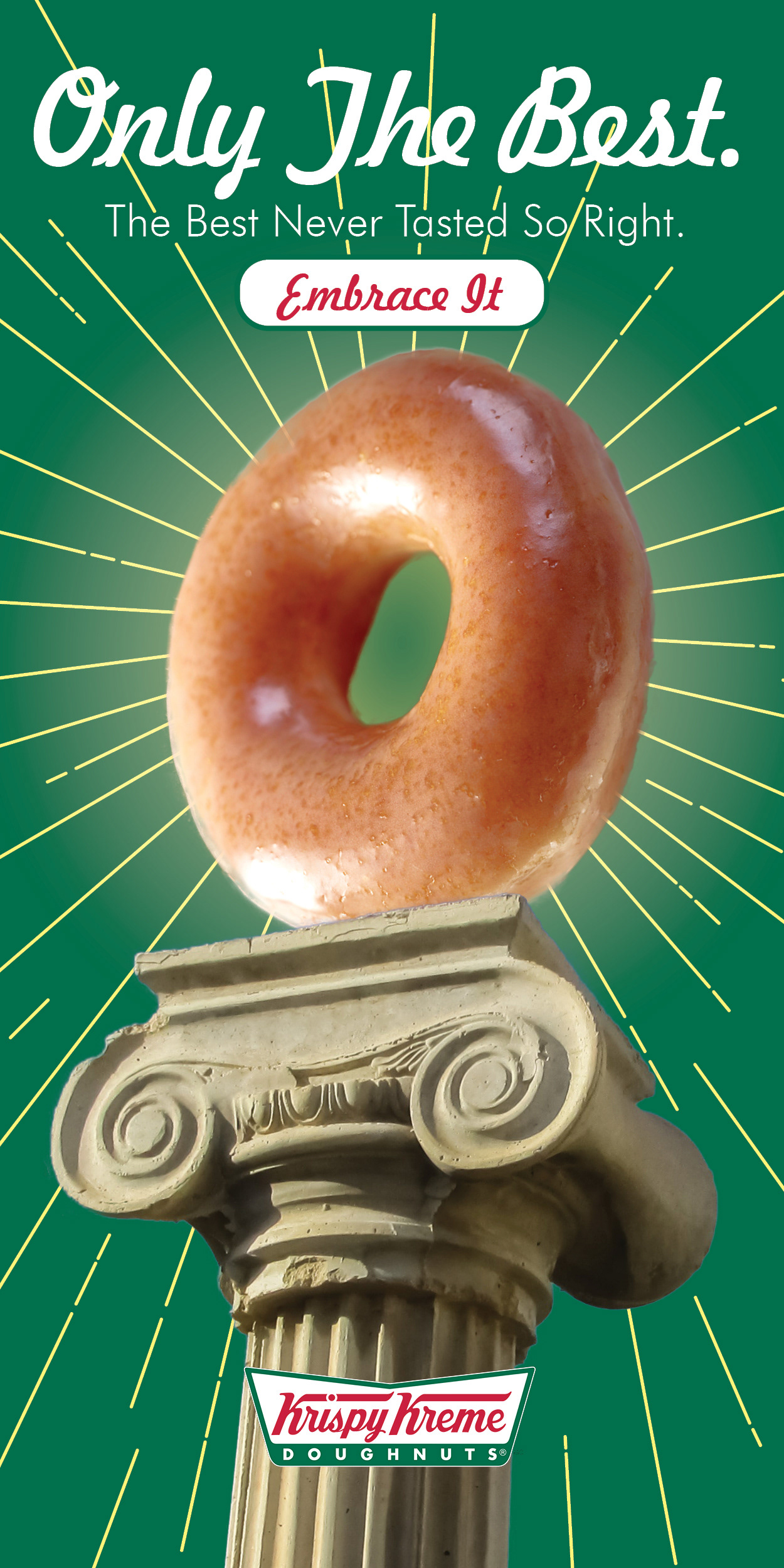
Blending the realistic aspects of this project- the donut, with the illustrated aspects was a challenge. However, I ultimately embraced them by combining a realistic pedestal and donut with minimalistic sun rays to make it fun and playful.
Using the idea of a “Humble brag” this design aims to put the spotlight on Krispy Kreme’s signature glazed donut, —although this design is modular for any donut the client may want to use.


______________________
Different social platforms
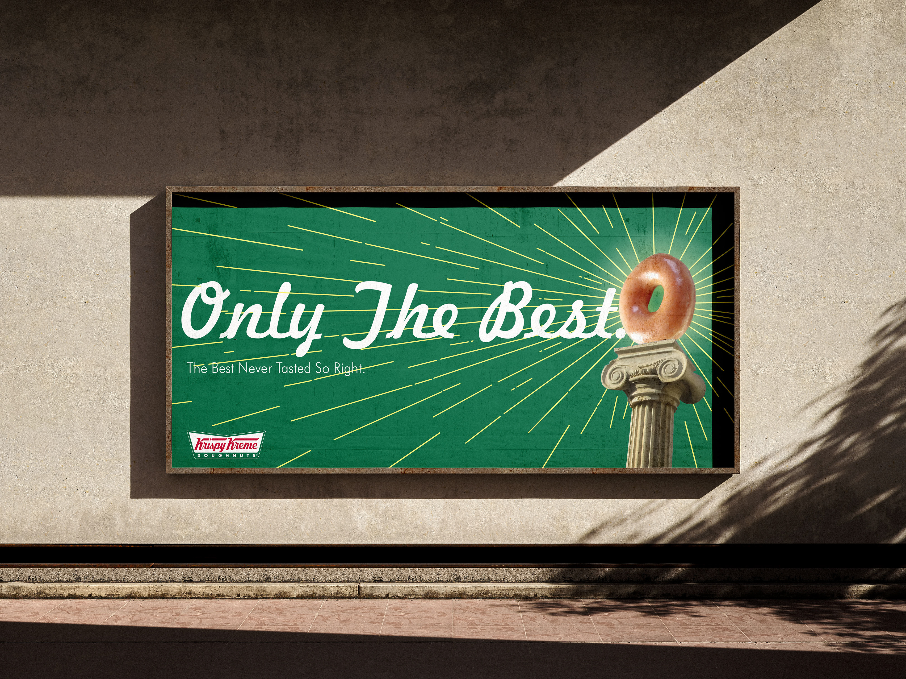
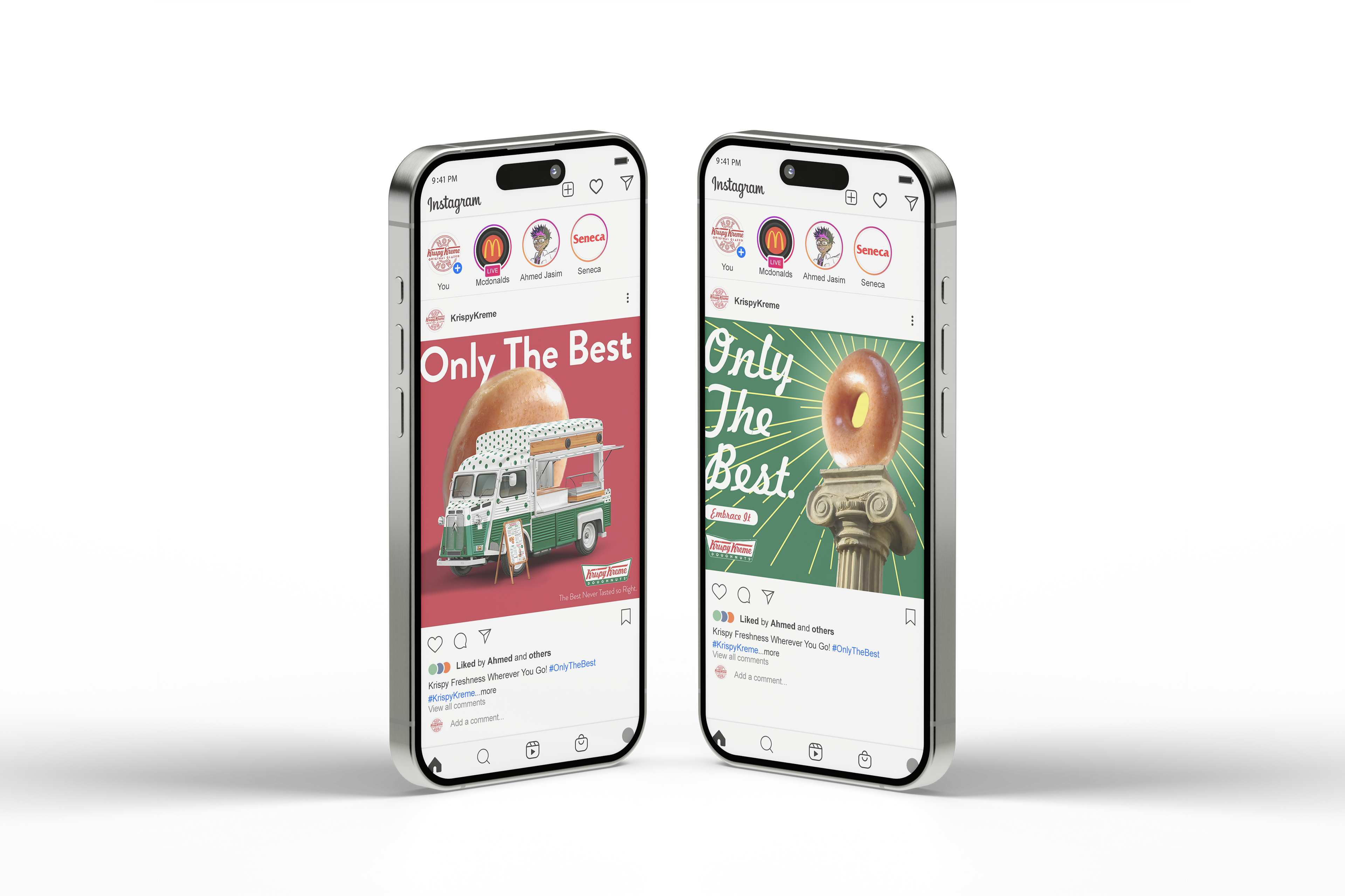
Here are different formats and variants for ease of use across different mediums, making it easier to use across platforms and locations, such as skyscrapers, billboards, full mobile screens, etc.
Different social platforms
Here are different formats and variants for ease of use across different mediums, making it easier to use across platforms and locations, such as skyscrapers, billboards, full mobile screens, etc.
_______
Mockups
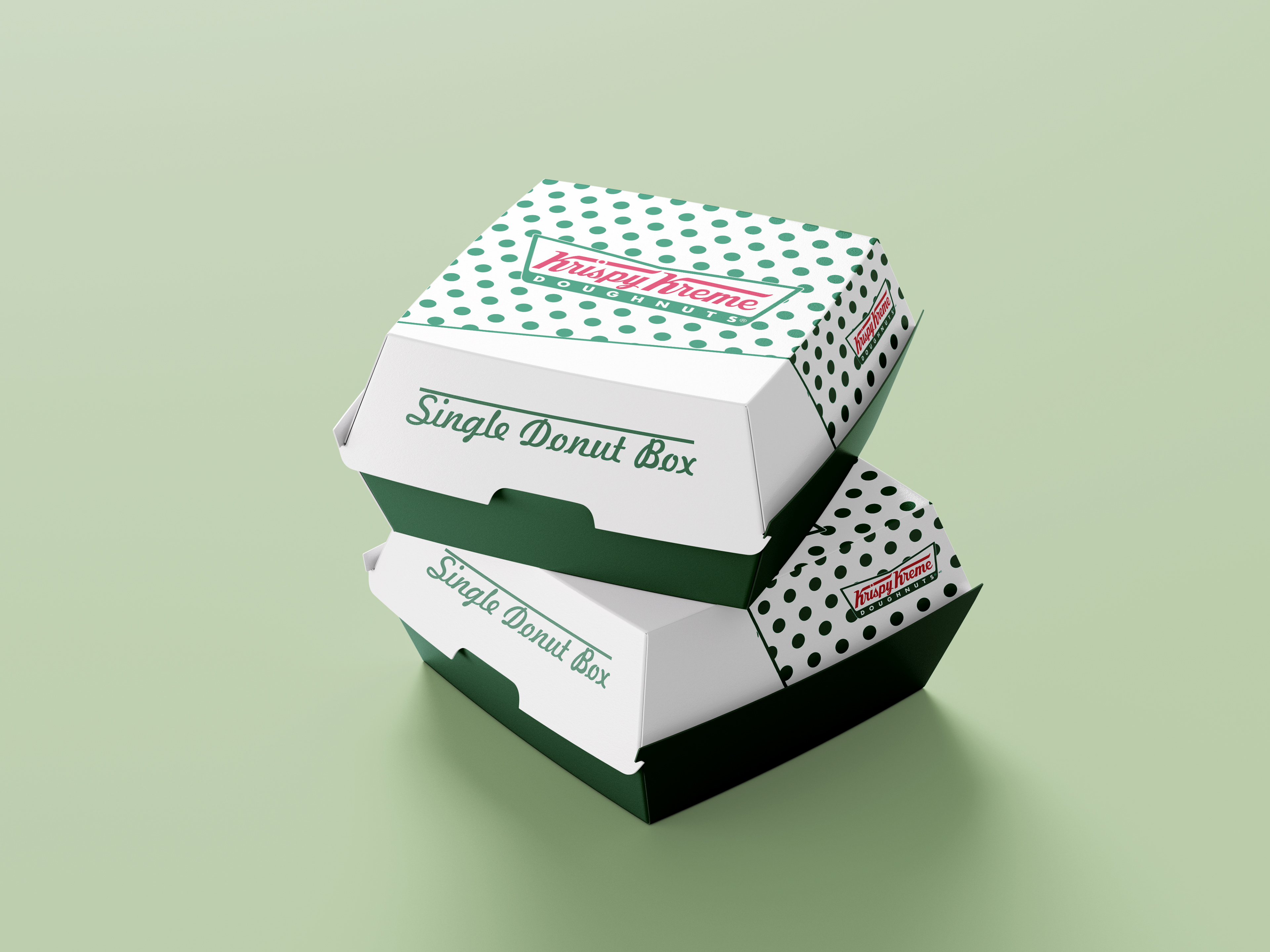
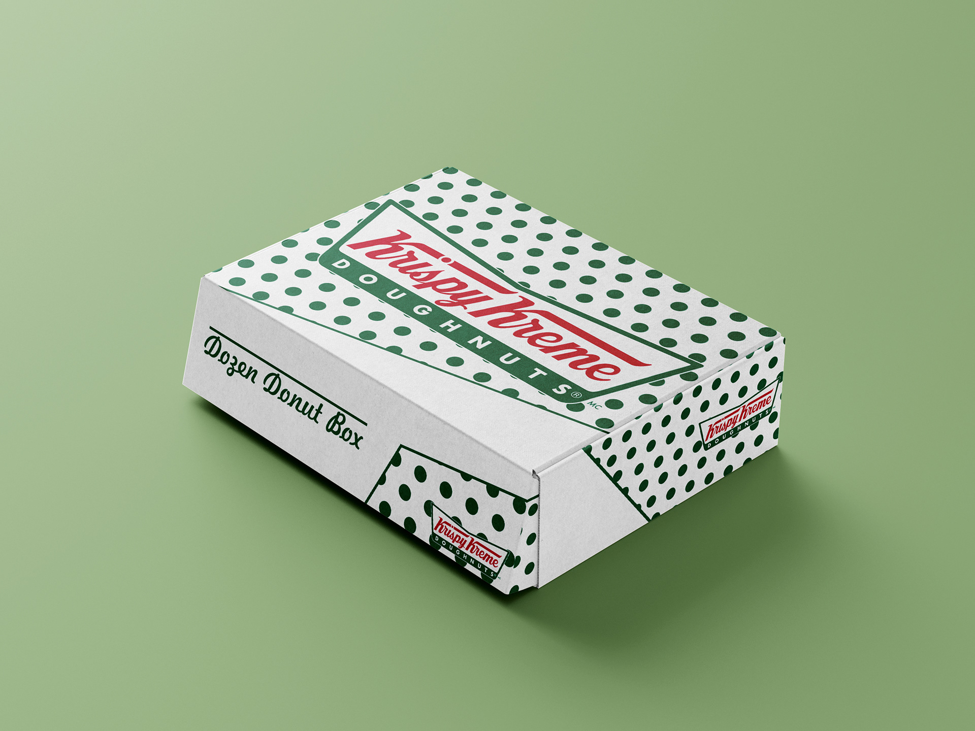
A series of mockups and posters that showcase the different aspects of the campaign, including the food truck, several posters, social media posts and new packaging to match the campaign.
Mockups
A series of mockups and posters that showcase the different aspects of the campaign, including the food truck, several posters, social media posts and new packaging to match the campaign.
